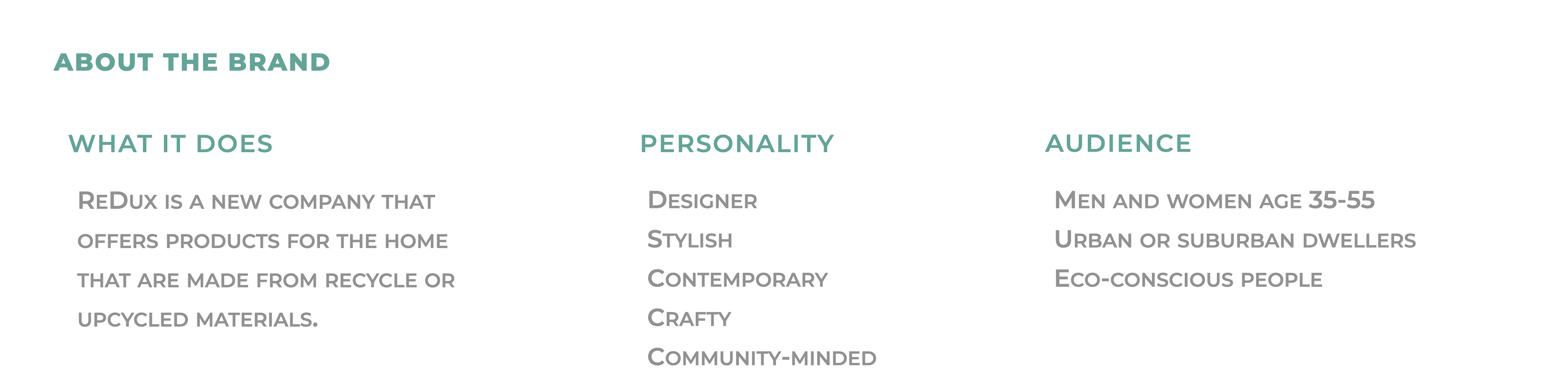
ReDux is a furniture and home decor brand targeted at age 35 - 45 urban and suburban dwellers.
For its brand identity, I chose a minimalist yet stylish approach, infusing a sense of warmth and affection. This choice mirrors ReDux's philosophy of simple elegance and comfort, creating an inviting and contemporary visual language that speaks directly to the heart of modern living.
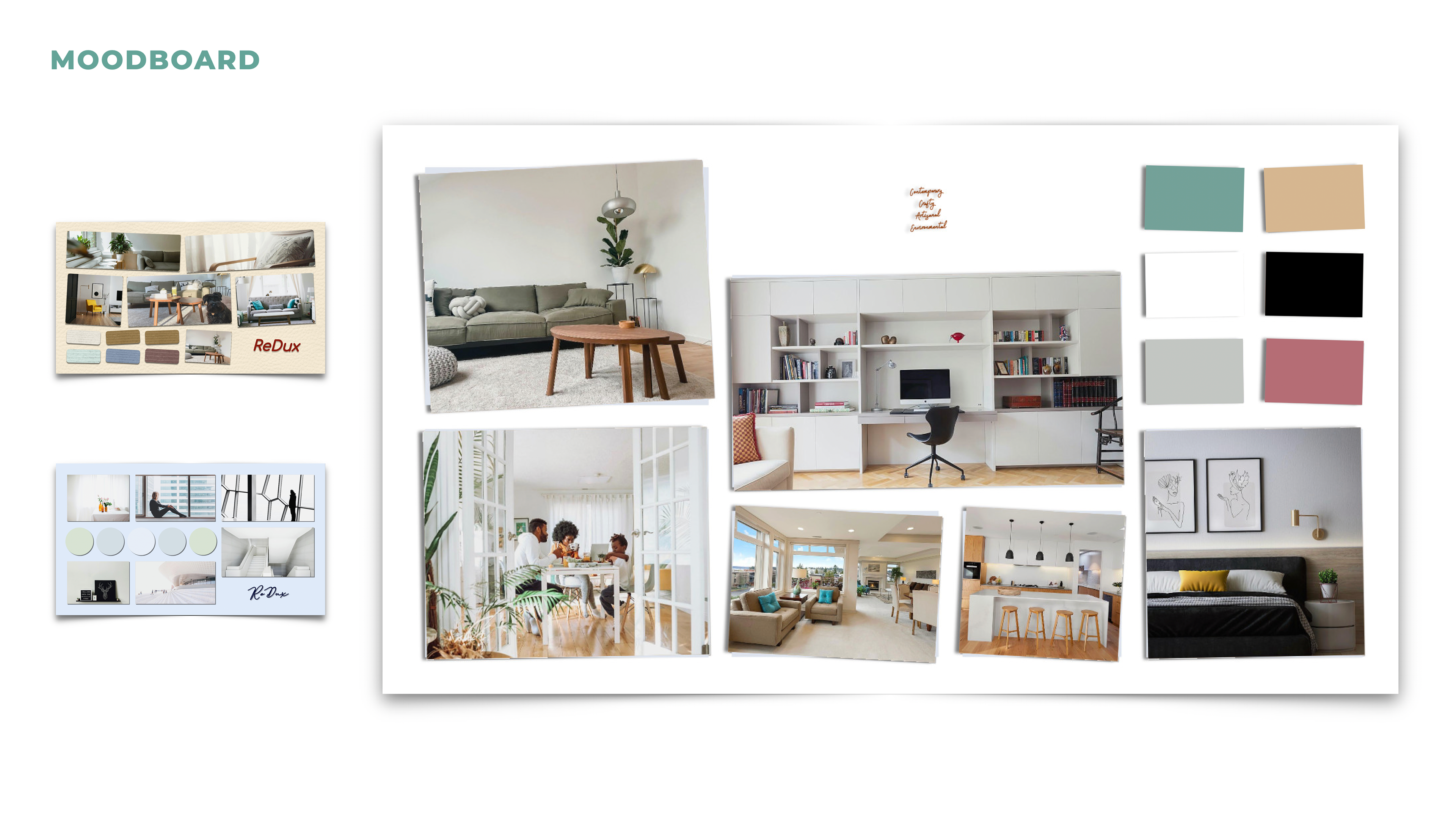
For ReDux's branding colors, I opted for bright, less saturated hues. These choices reflect a contemporary edge and a serene ambiance, aligning with the brand's vision of chic, tranquil living spaces.
It was really fun playing with those letters. I tried to convey the sense of eco-consciousness using symbols of leaves and buds, and to build its stylish personality using squares.
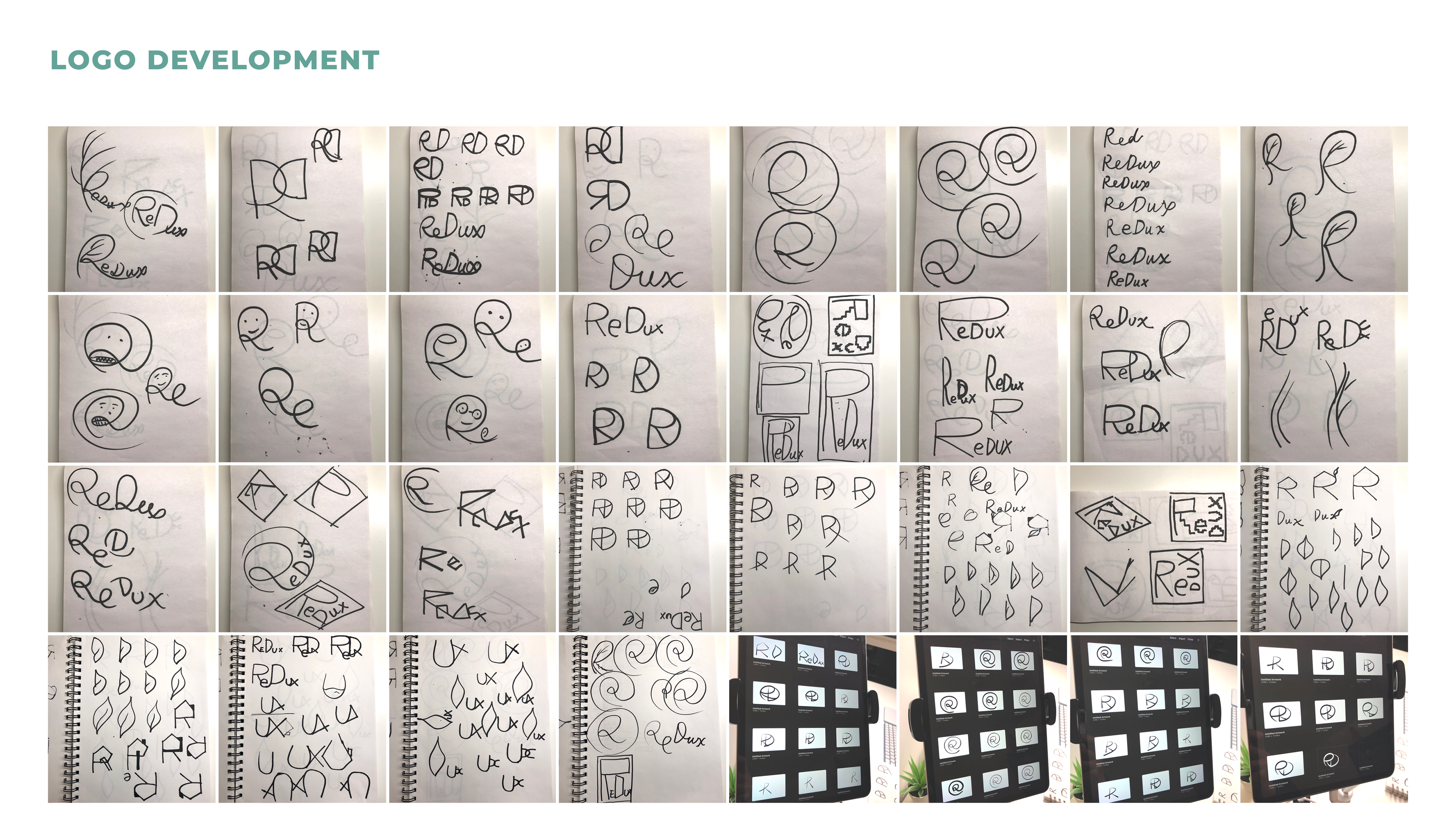
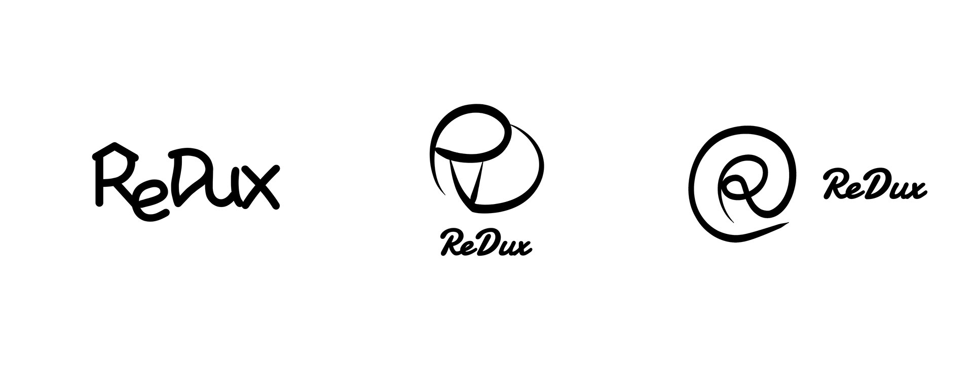
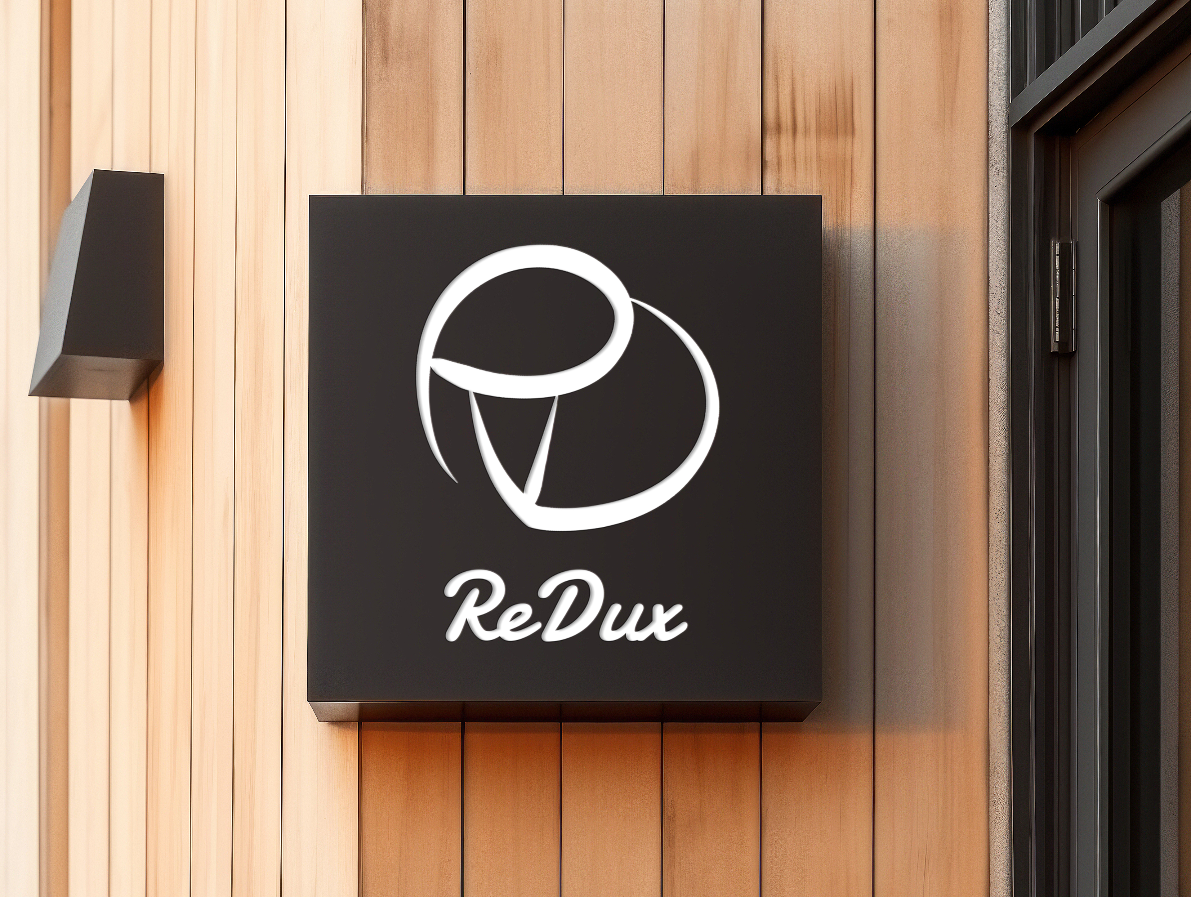
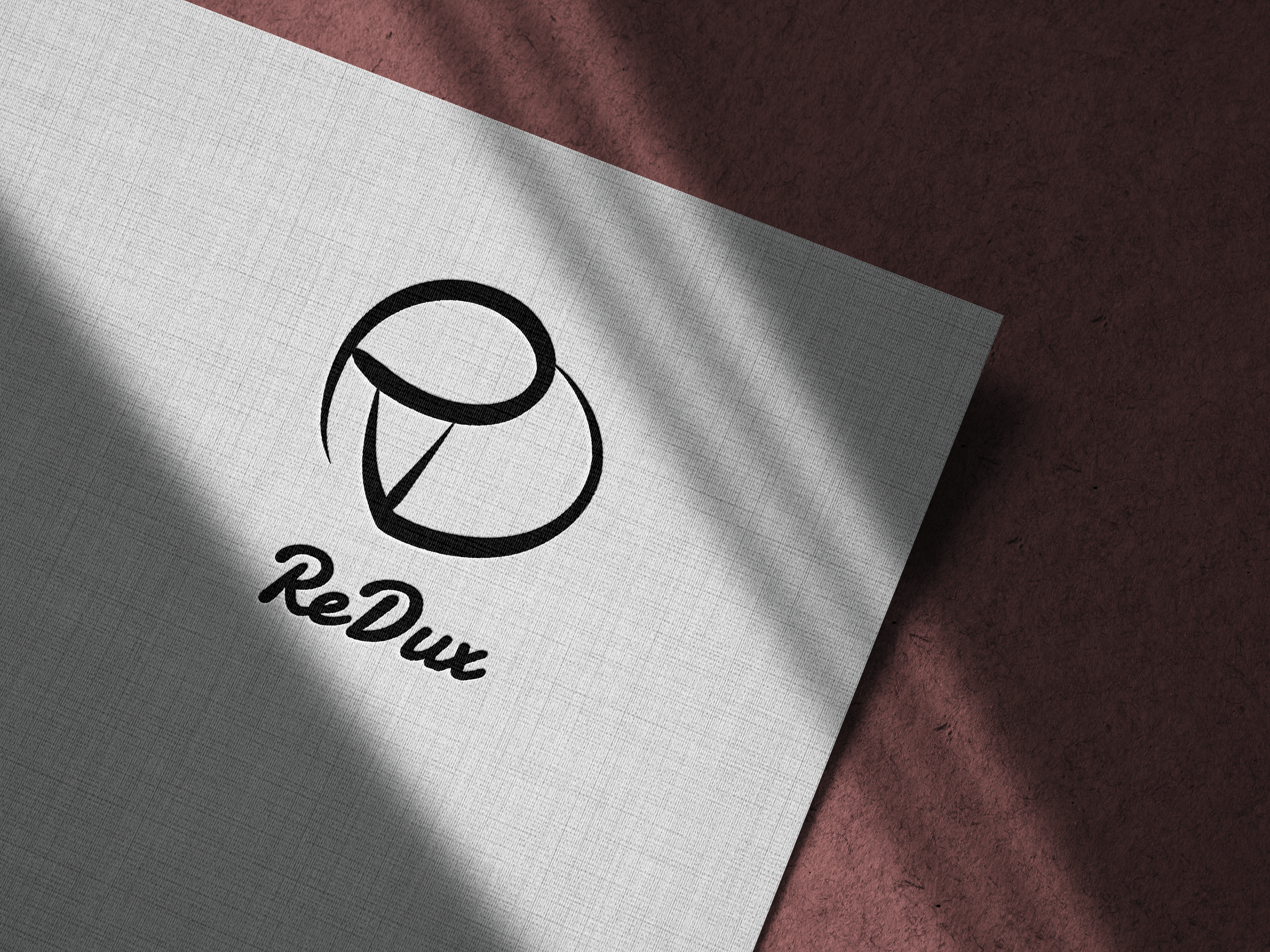
These are the three final choices for its logo design.
In the first logo, the letter R resembles the roof of a house, which would be easily associated with a brand that sells furniture and decor; in the second, the initial letters R and D jointly represent the shape of a heart, thus evoke the feeling of a loving home; the letter R in the third logo reveals the brand's chic and contemporary style.
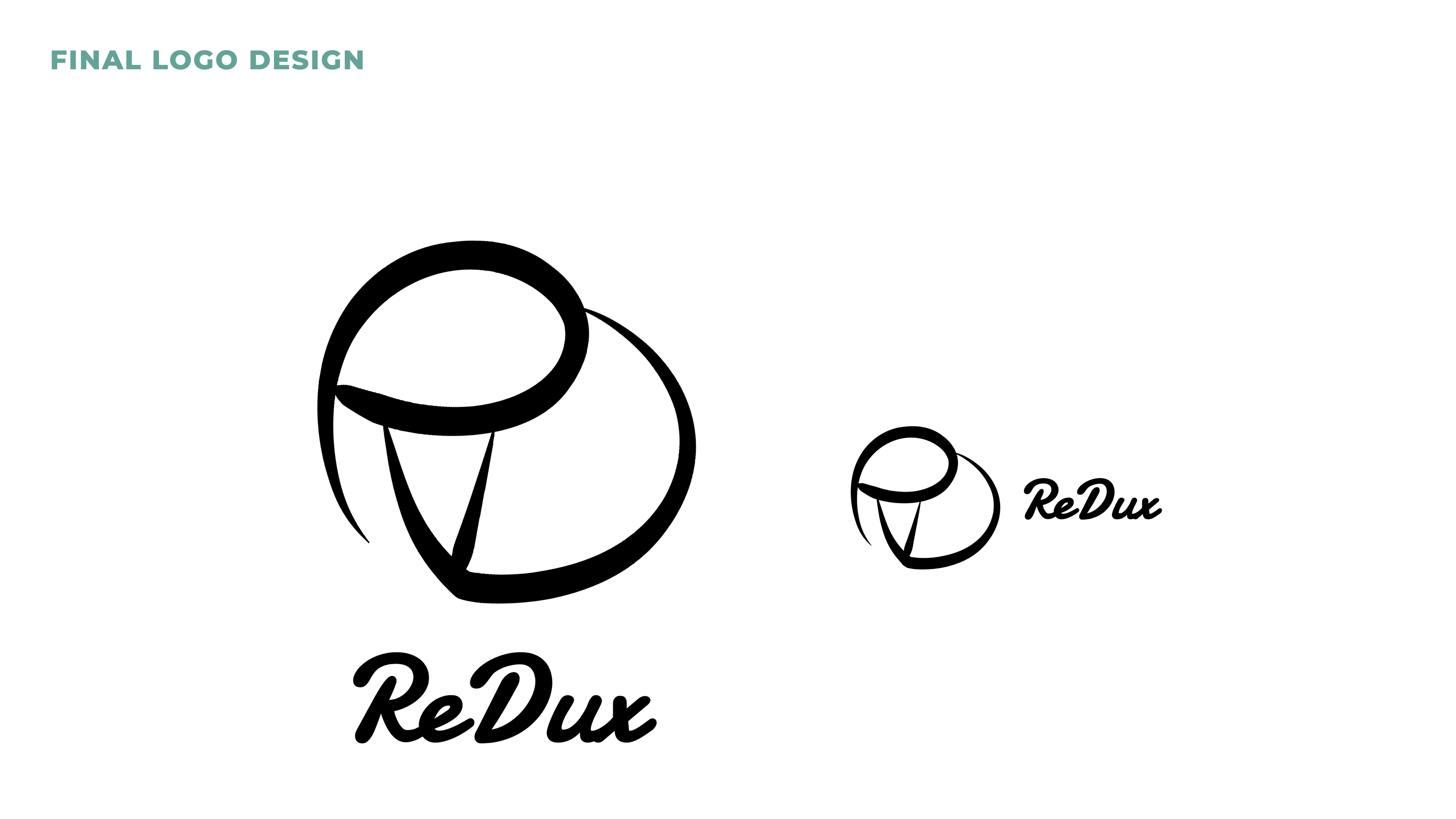
I chose this logo for its aesthetics: it's more elegant. In order to find the font that matches this logo, I went through all the fonts back then that Figma provided.
The left version can be used in bigger prints; the right version, smaller prints.
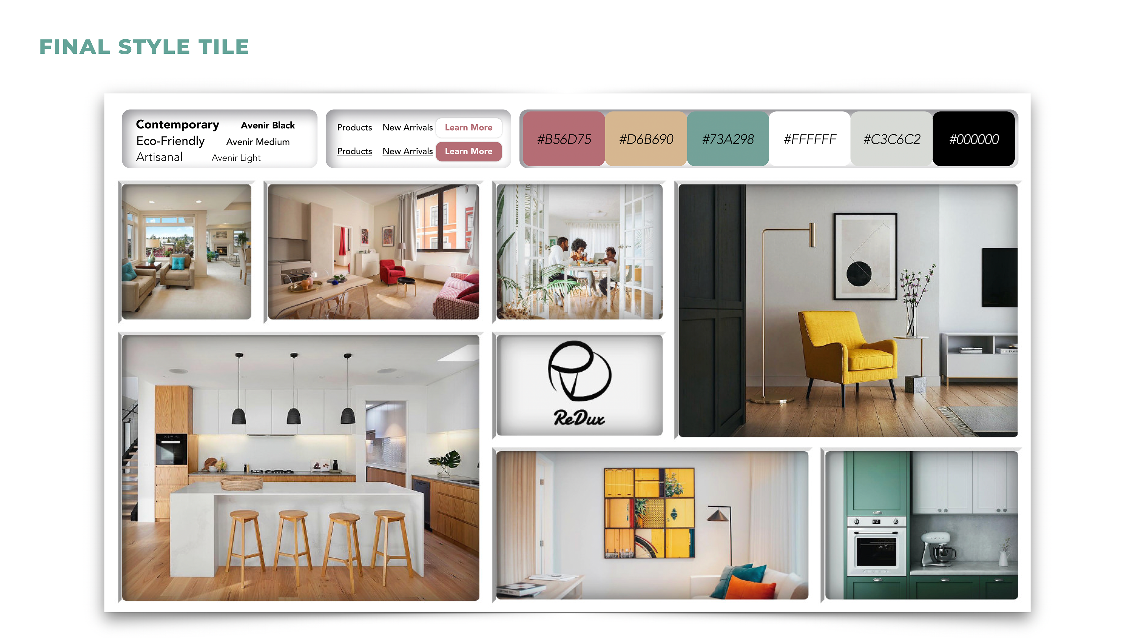
The resemblance of window panes gives the structure of the style tile. The font Avenir is often associated with a clean, modern, and elegant feel, making it versatile for a wide range of design applications.
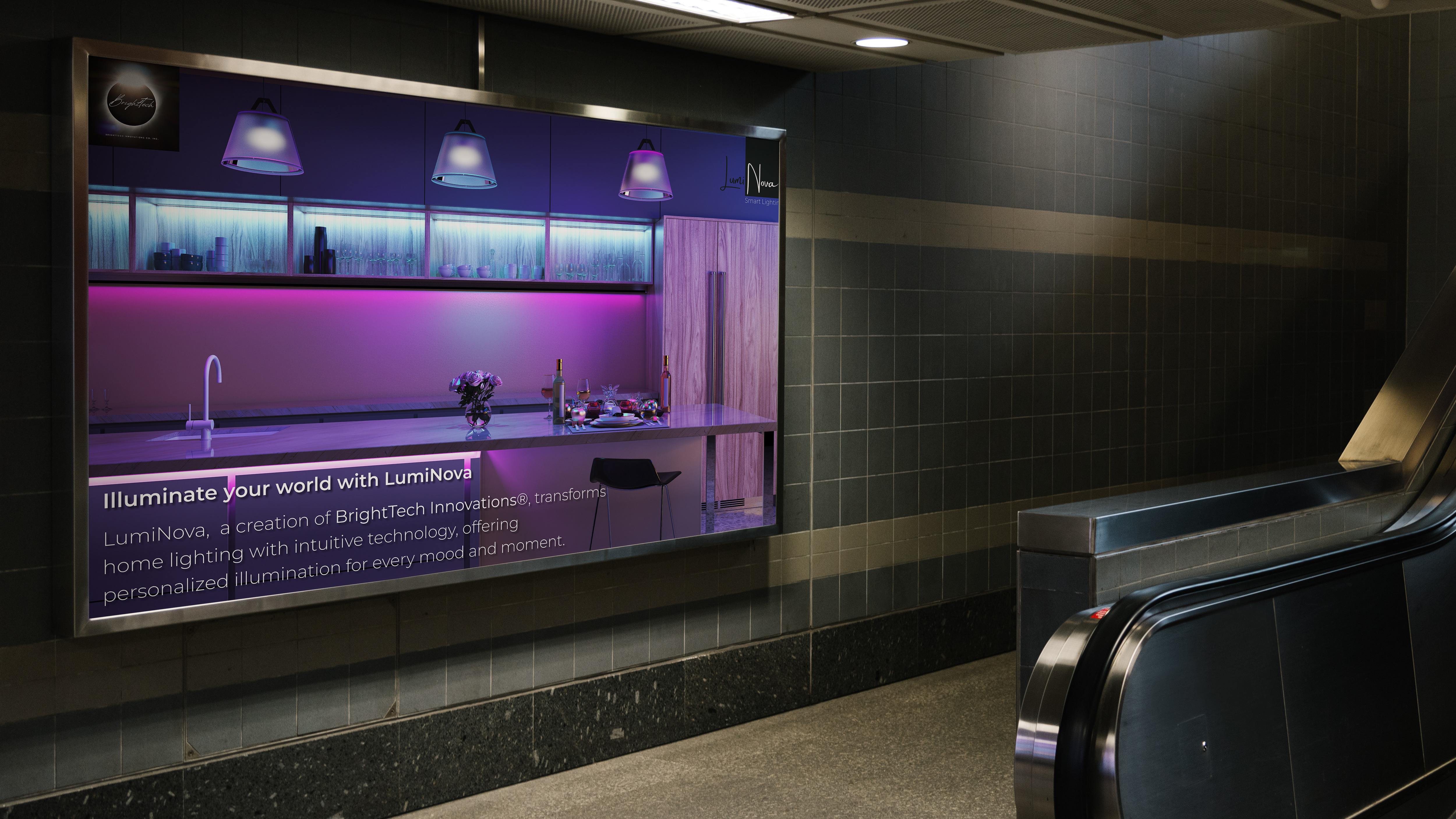
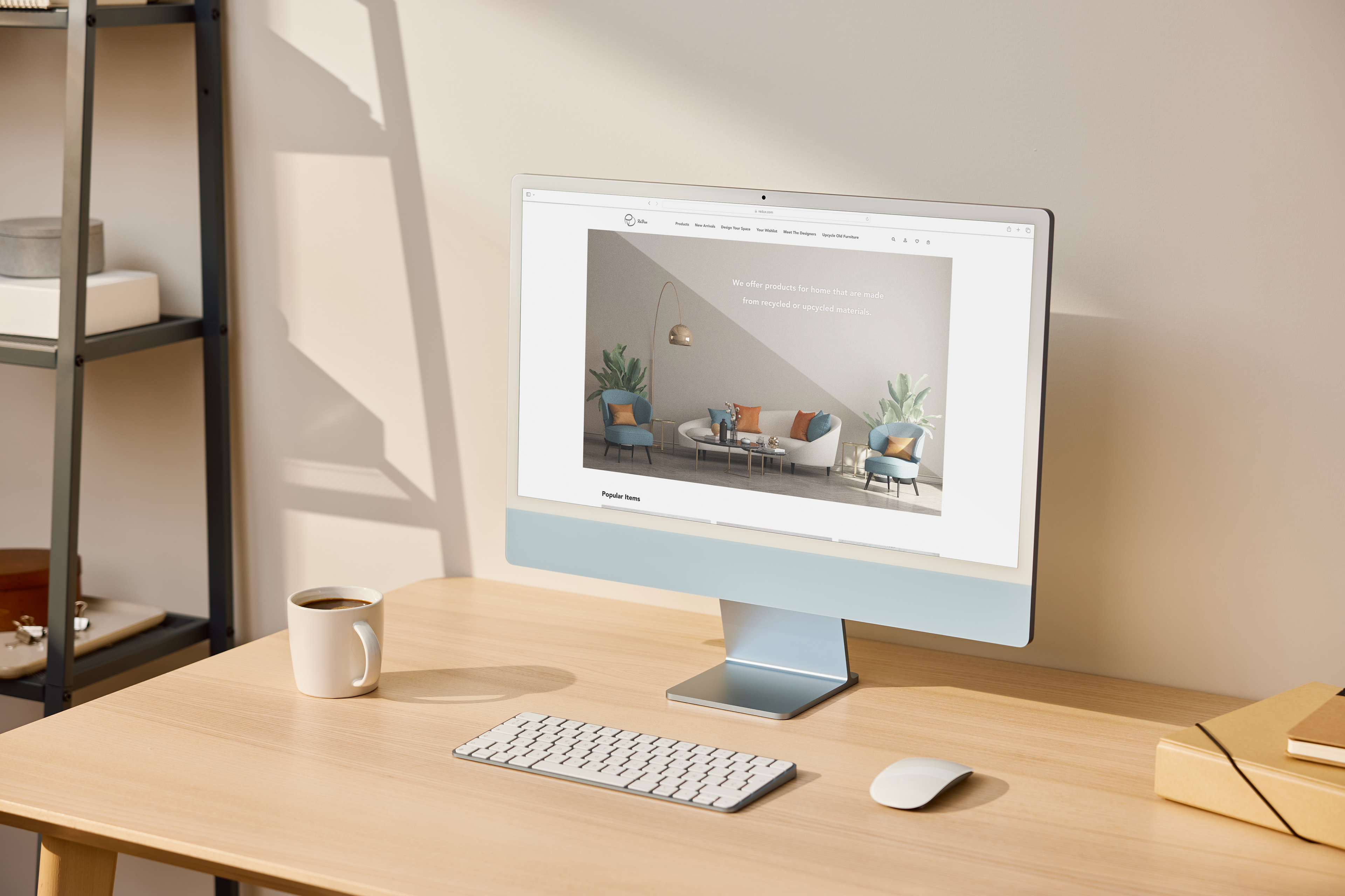
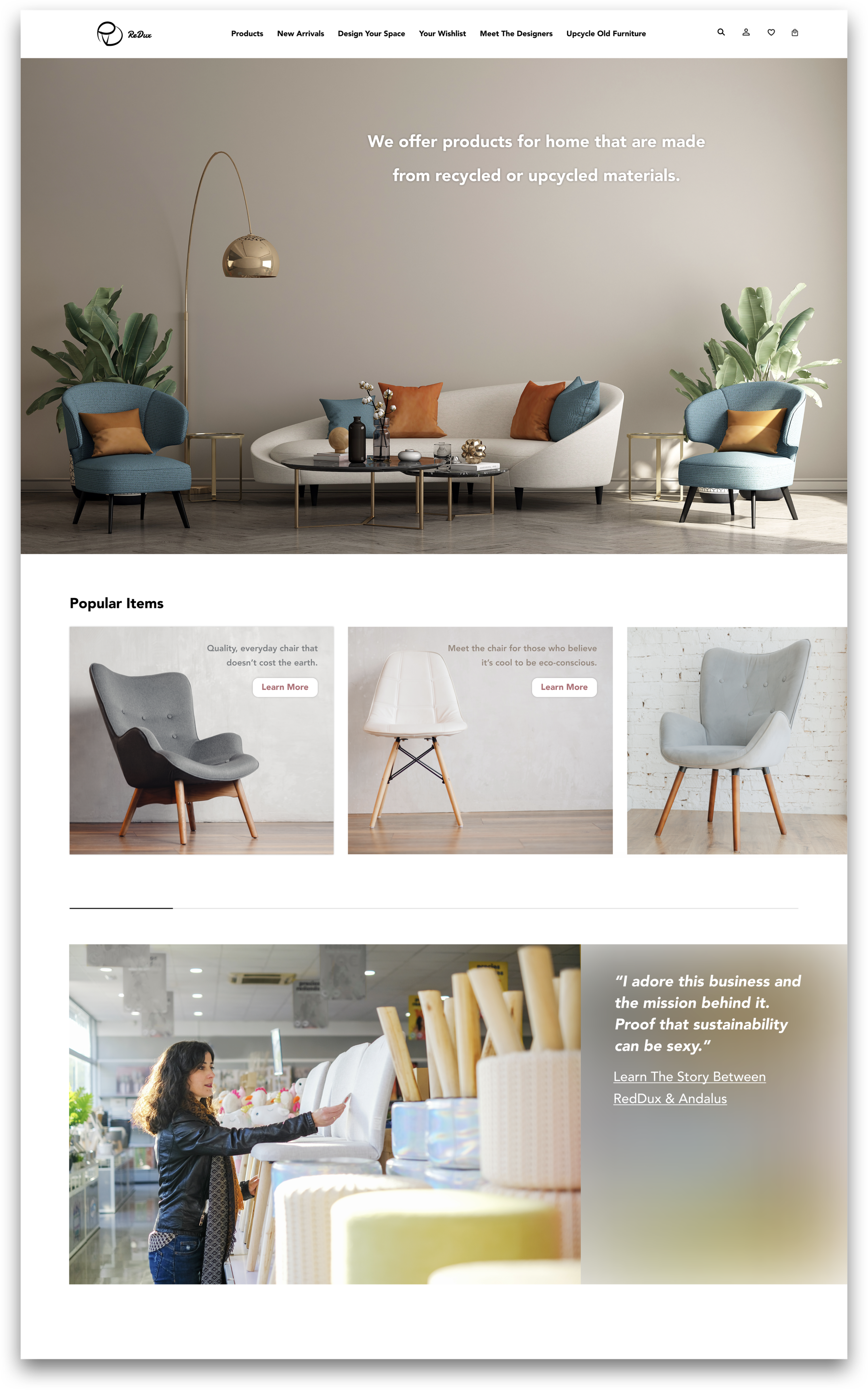
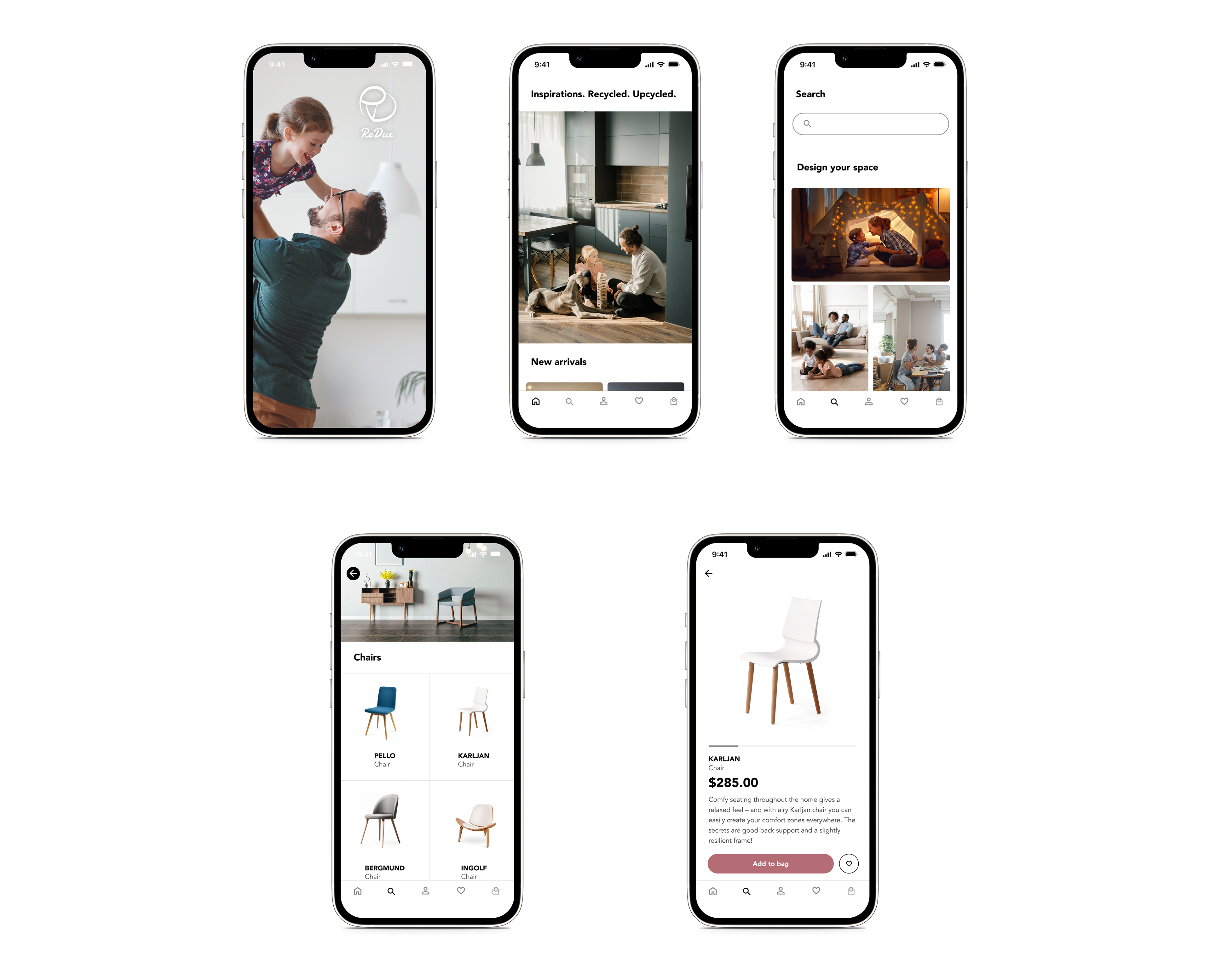
In the final website design (home page) below, I carefully selected images to give viewers a strong sensory reaction and impression.
(I intend to make them look big below, so if there are any flaws, you'll see!)
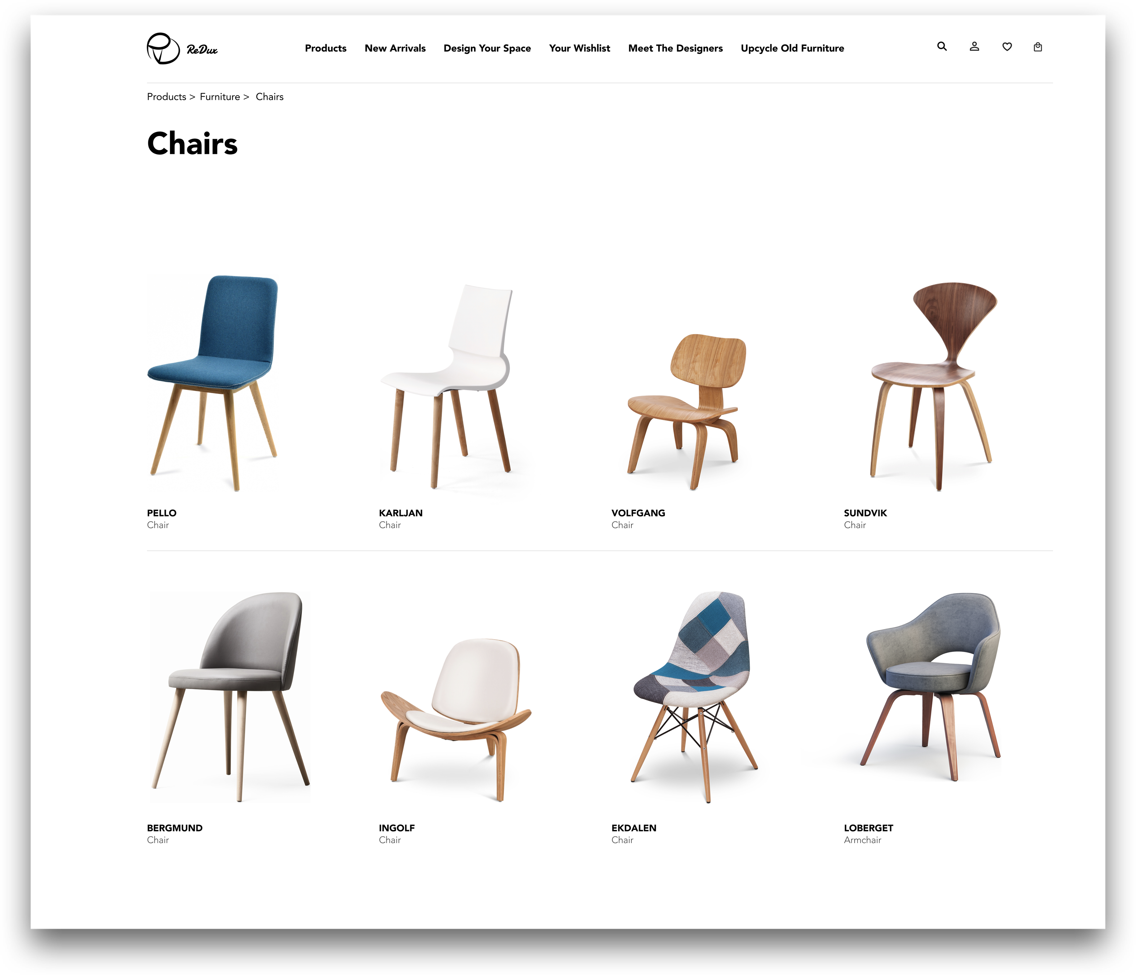
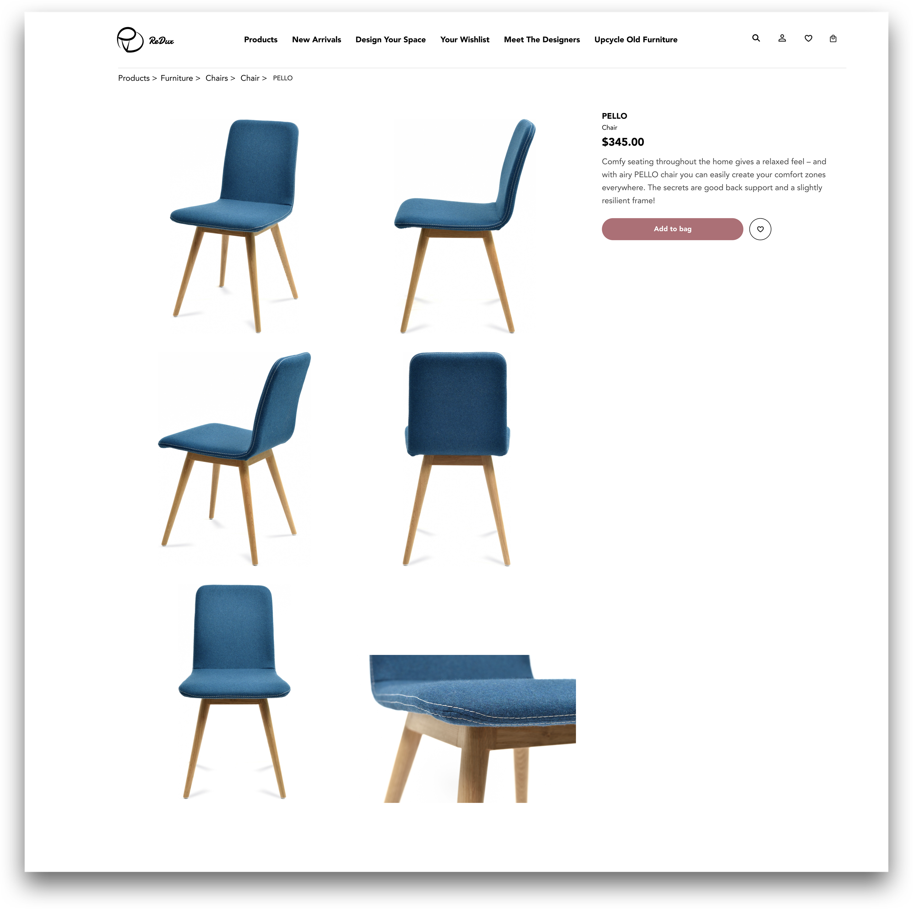
Below is the final website design (category page + product page).
It took some time to tune each item photo to the right size and align them all together.
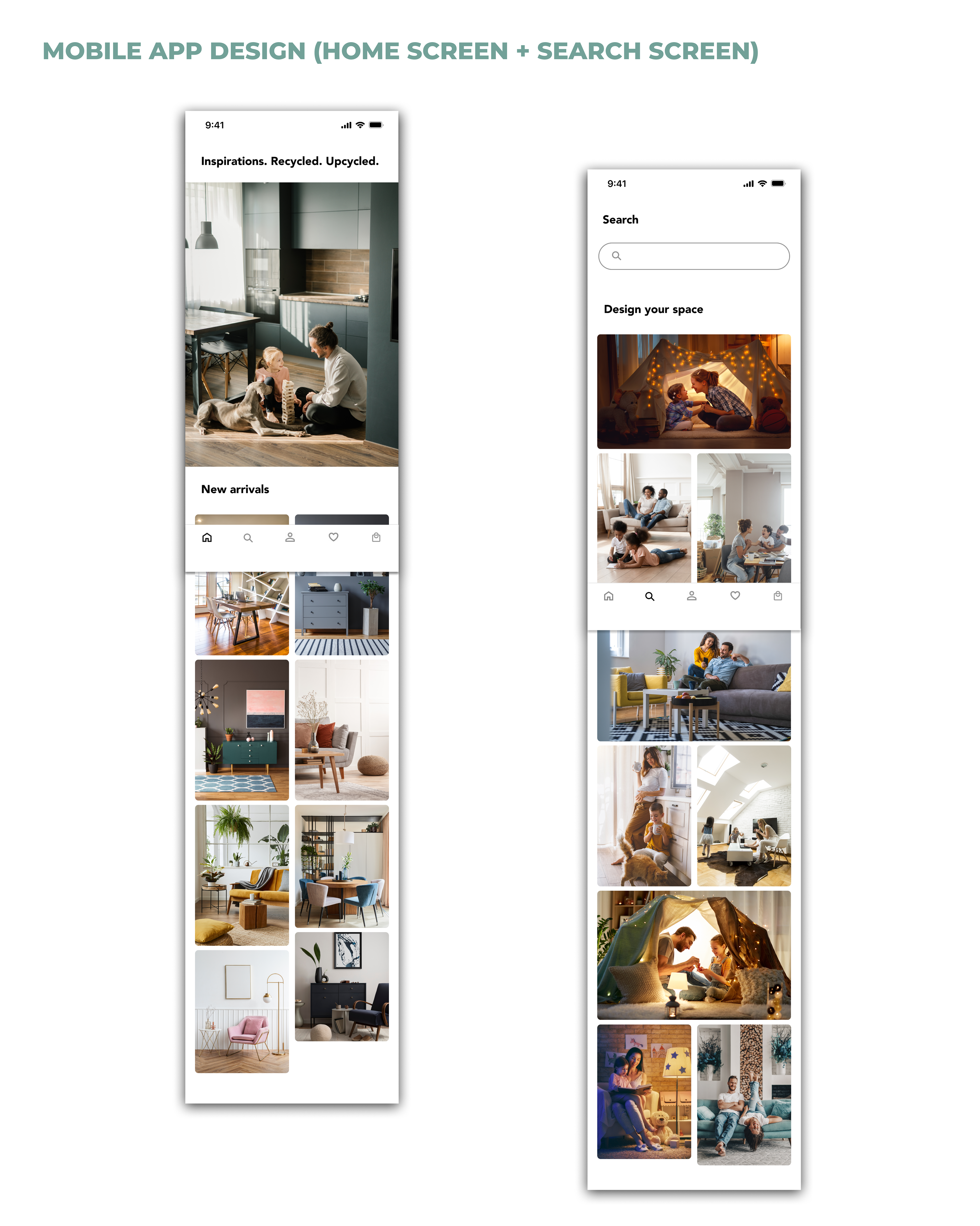
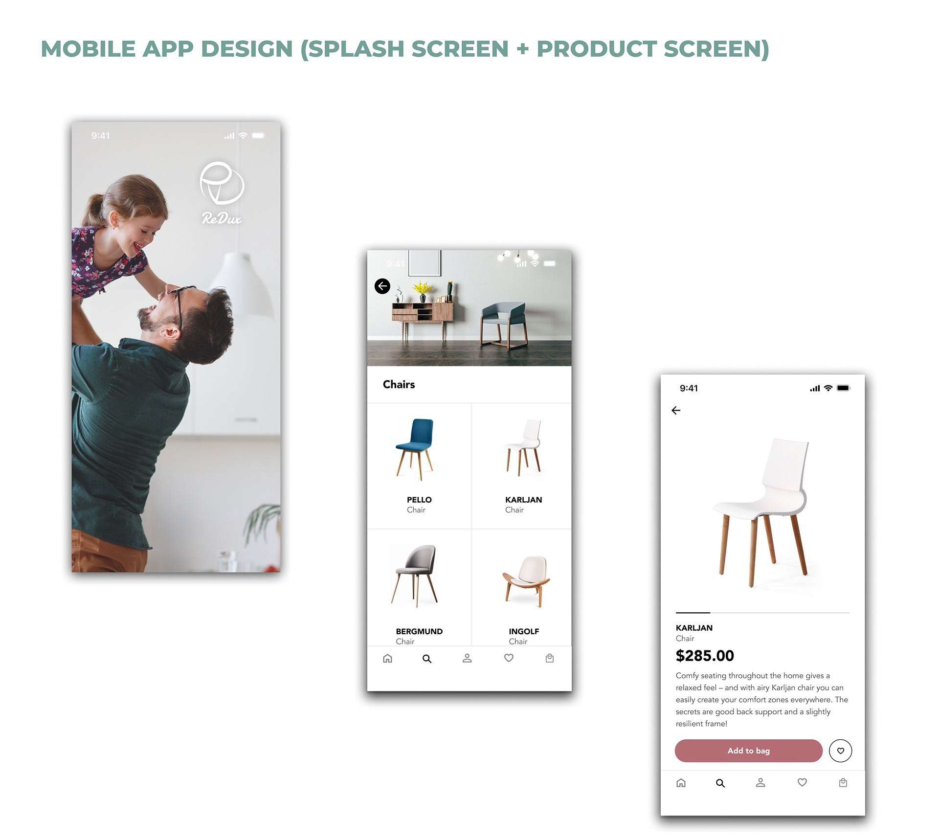
Using quality photos is a great way to let viewers envision how they would interact with an environment filled with ReDux's products. Those photos used in my mobile app design attract people with similar aesthetic tastes.
I used this father-daughter photo as the splash screen ☞ (the first one) because I hope the main intention behind customers' purchases is based on love and the pursuit of happiness for yourself and the people you love, not impulse.
•Upcycle with Style
•A new company that offers products for the home that are made from recycled materials or upcycled materials.
•Design Your Space Today
•www.ReDux.com
•ReDux / Logo
•A new company that offers products for the home that are made from recycled materials or upcycled materials.
•Design Your Space Today
•www.ReDux.com
•ReDux / Logo
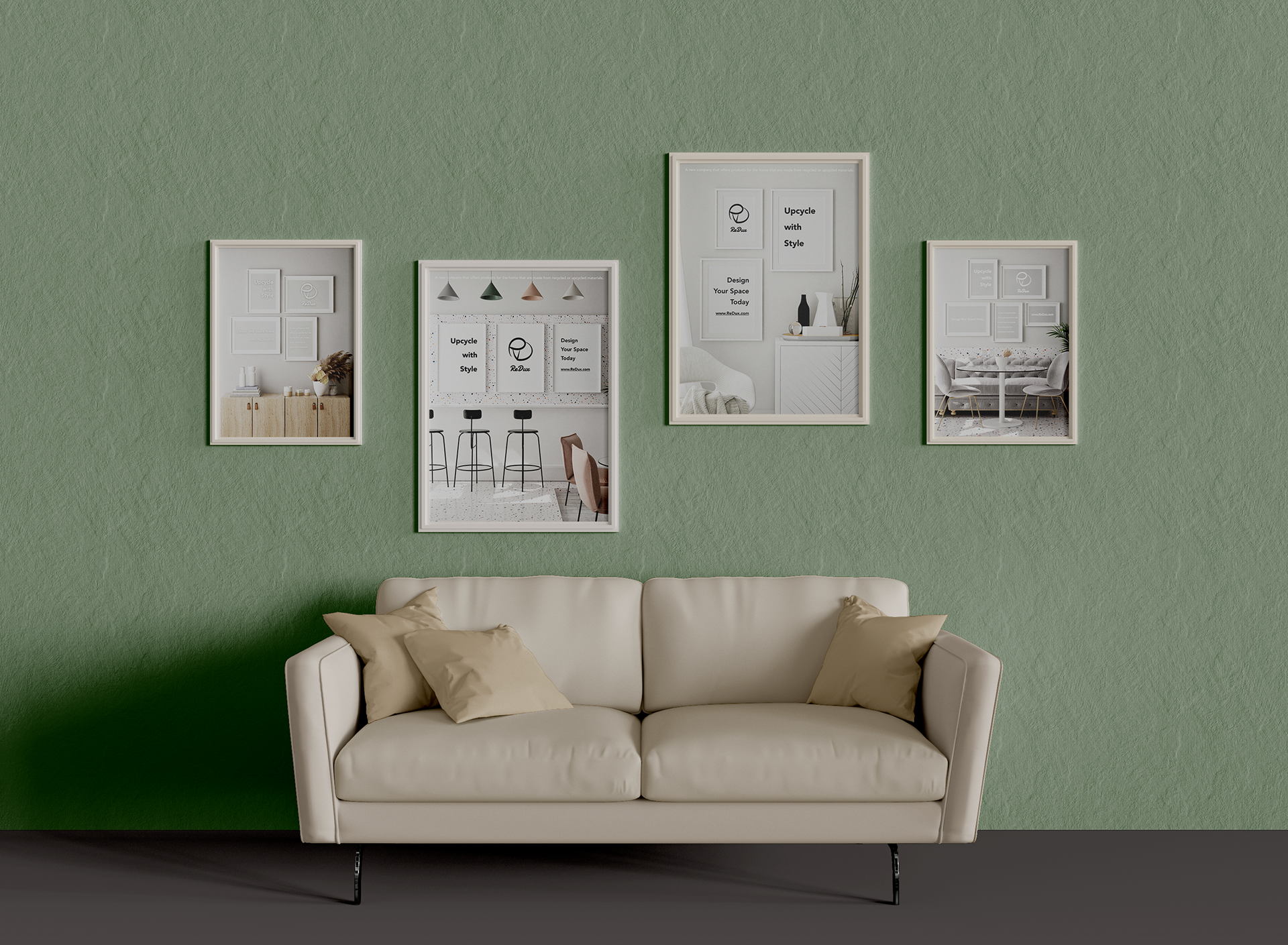
The idea behind my poster designs was to blend the brand identity naturally with its products.

The journey is the reward!