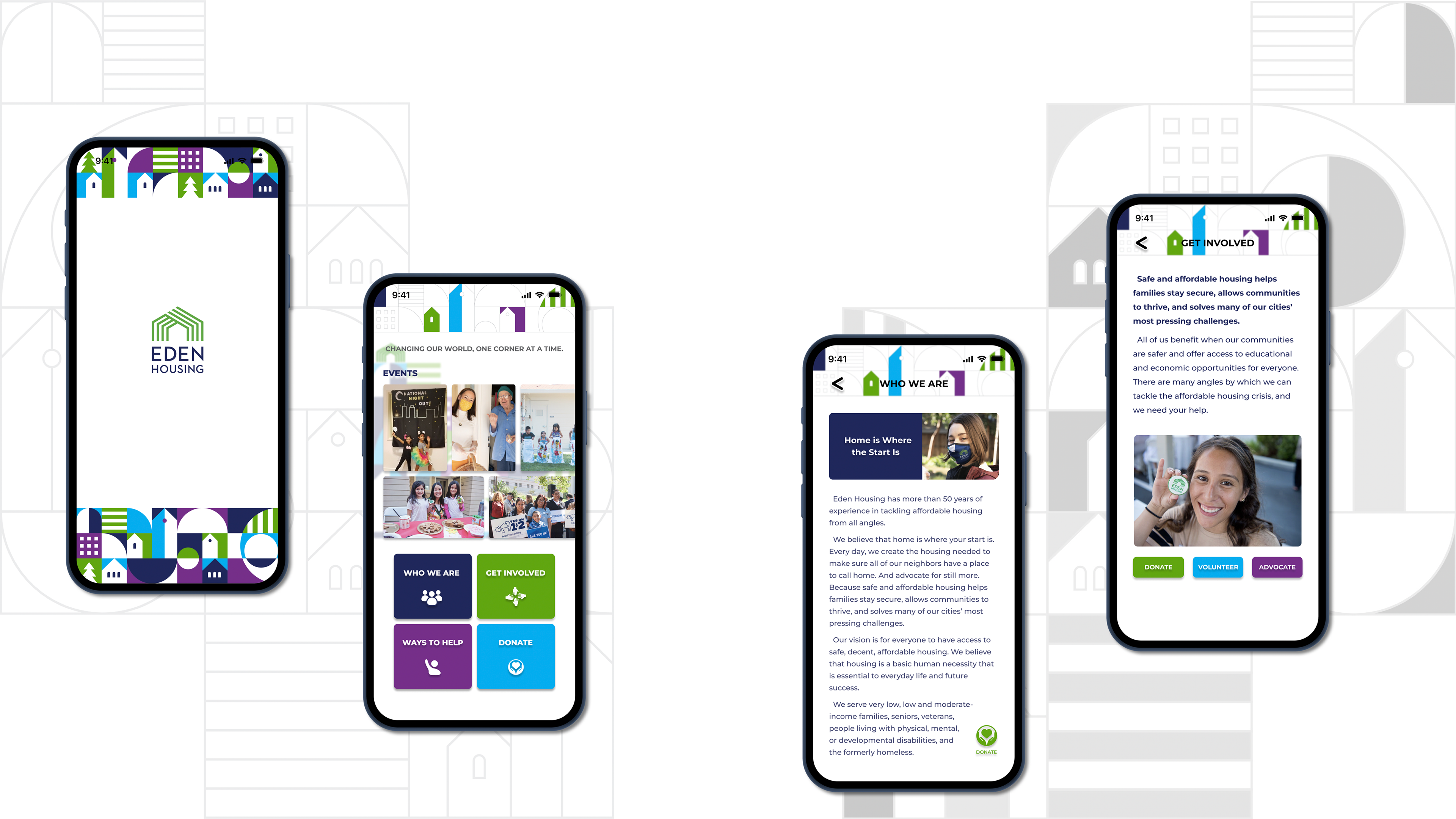
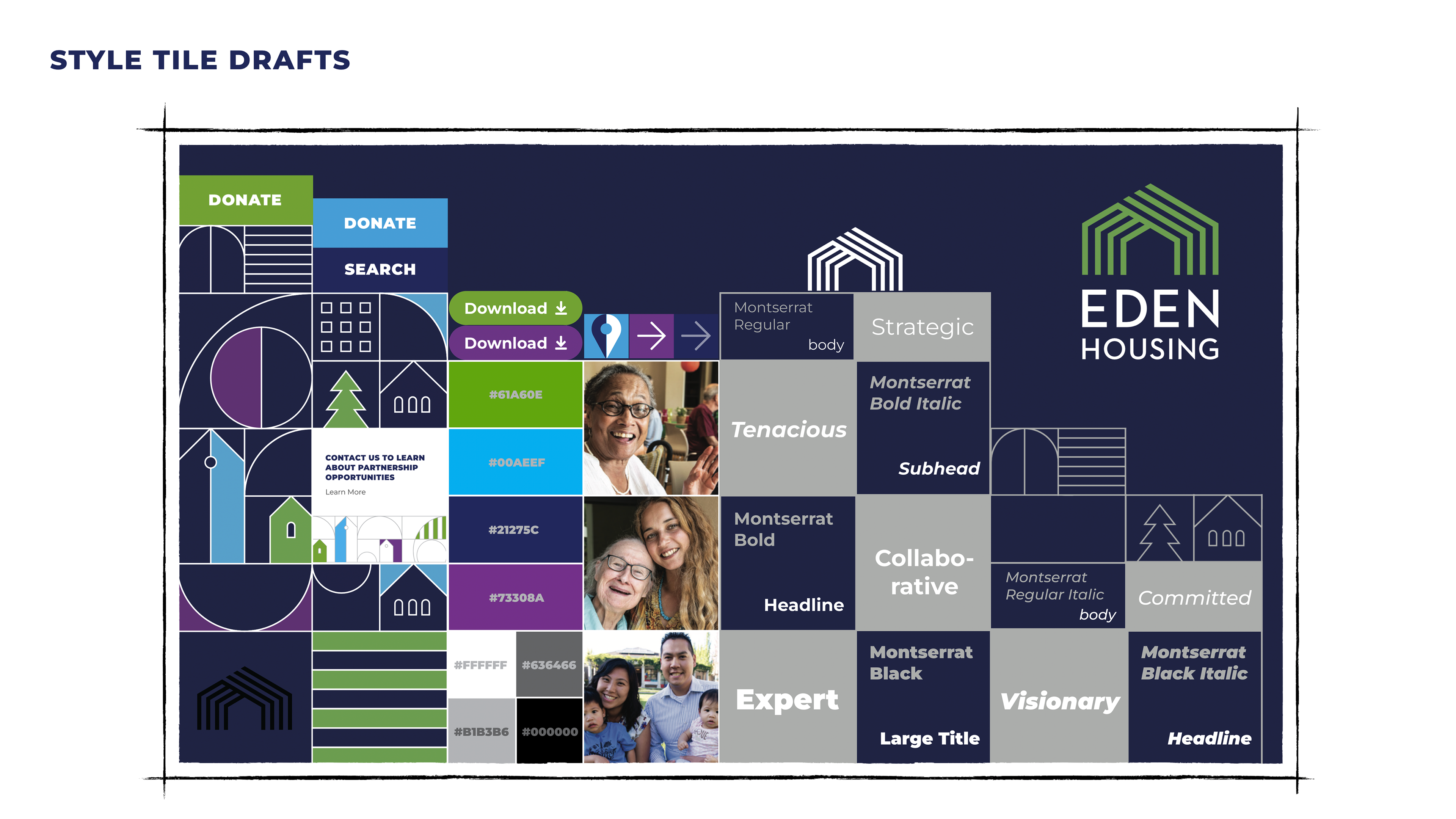
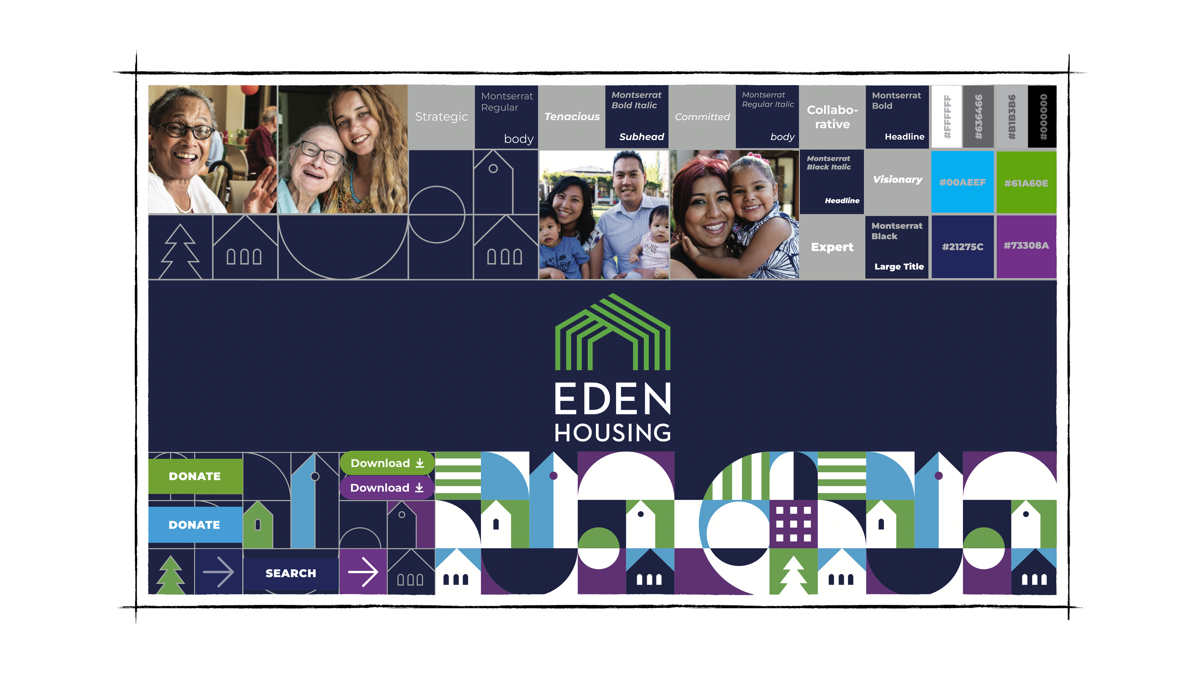
In the designs of those style tiles, I incorporated visual elements from Eden Housing's brand book (provided by my course instructor) to make them more playful.
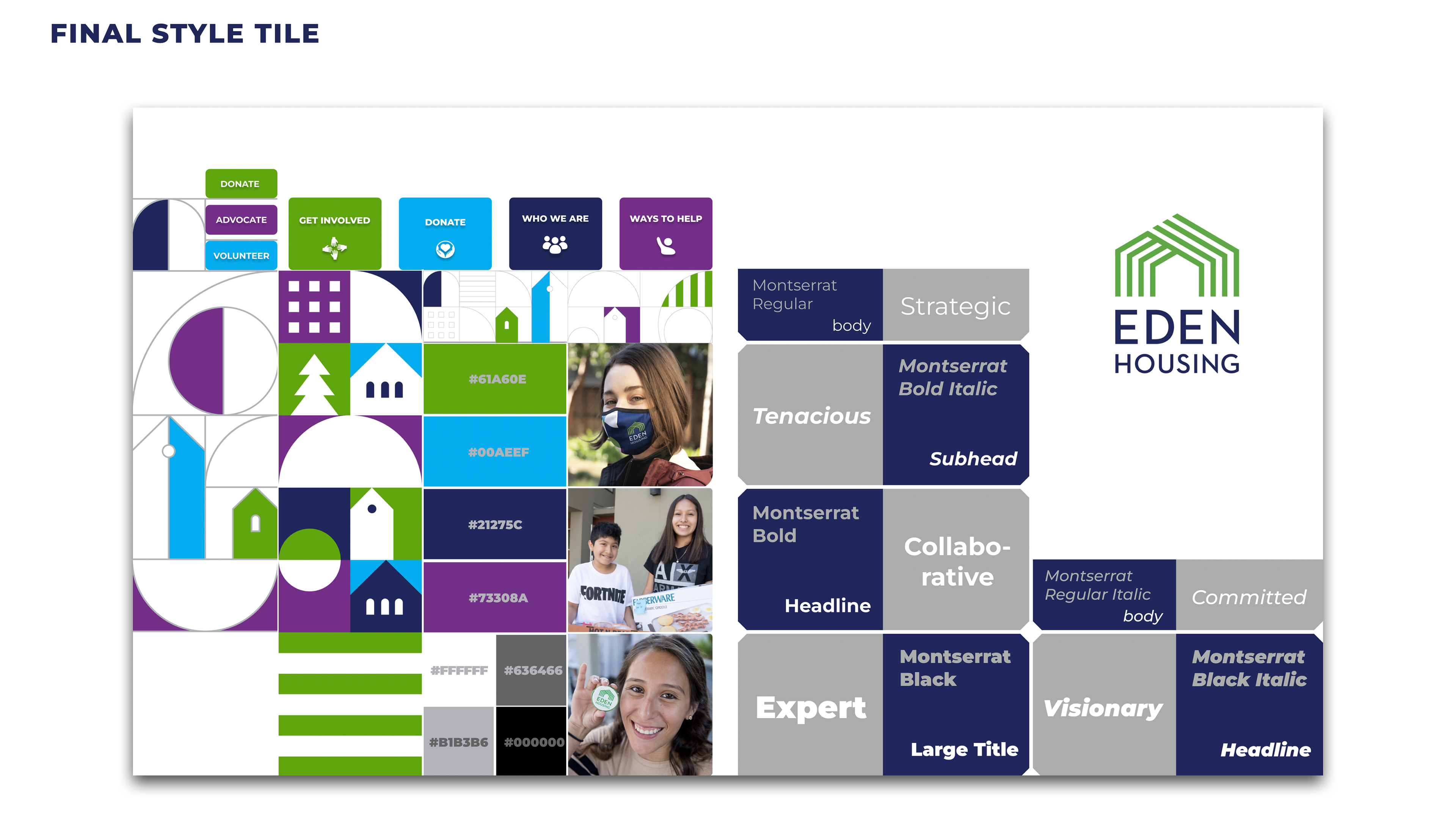
In the Final Style Tile, I changed the background to white color for a cleaner look.
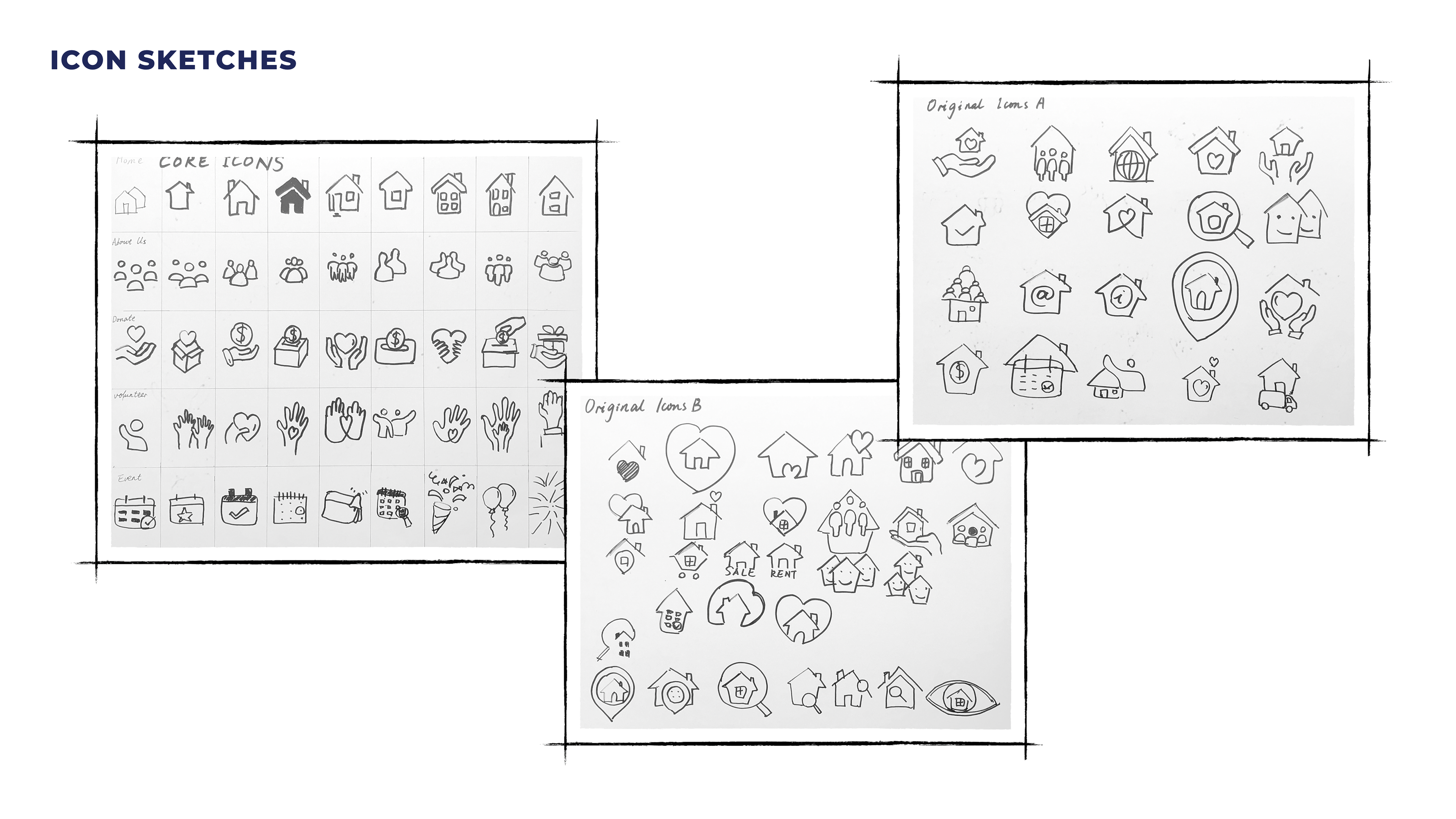
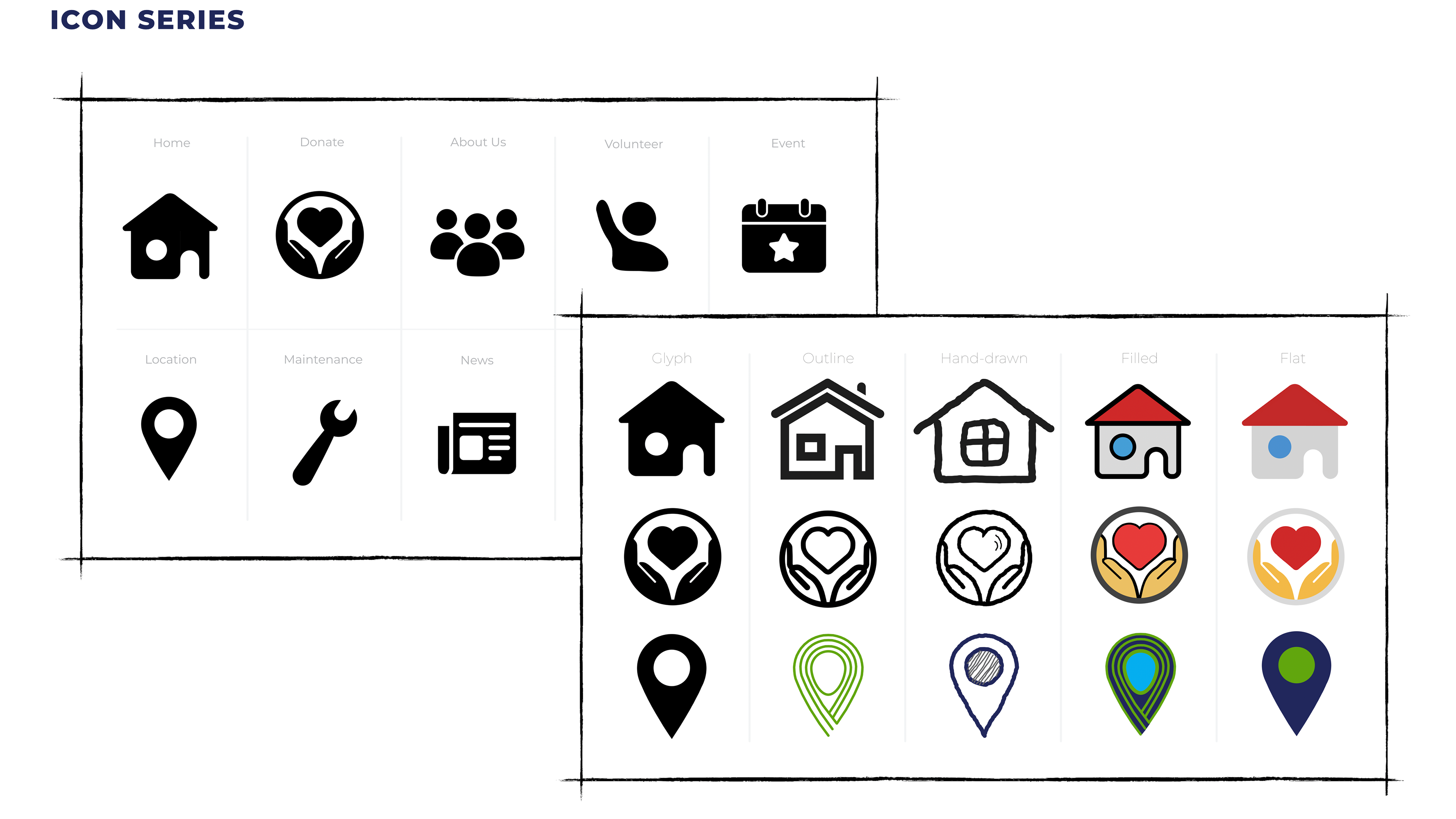
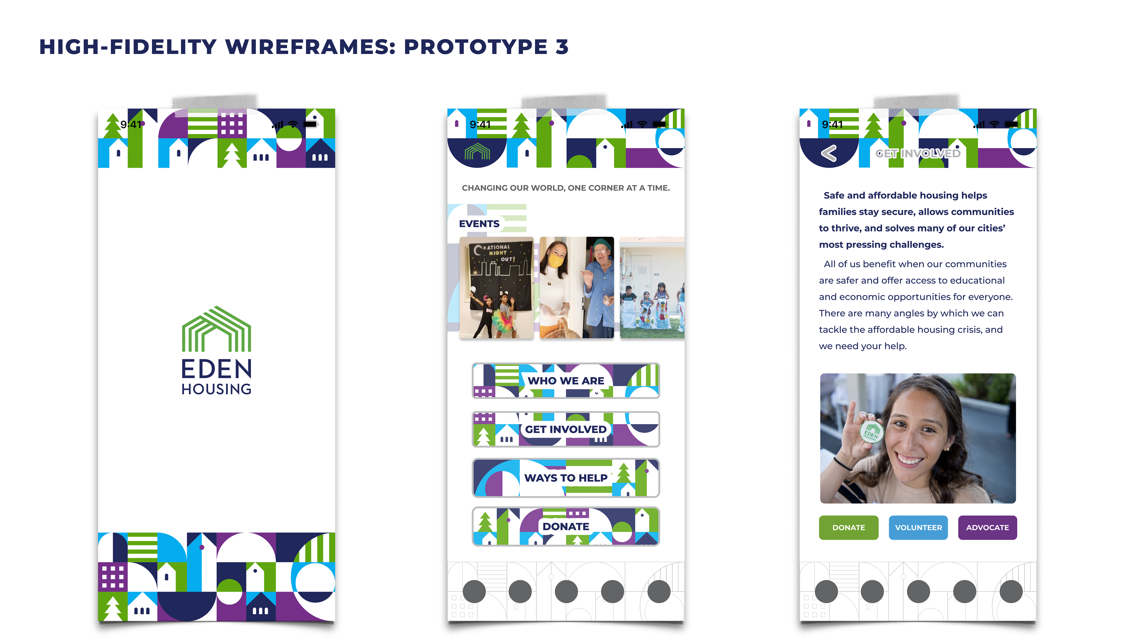
In the third row of the right page below, I embodied elements from Eden Housing's logo to make the icon design (the destination icon) more cohesive.
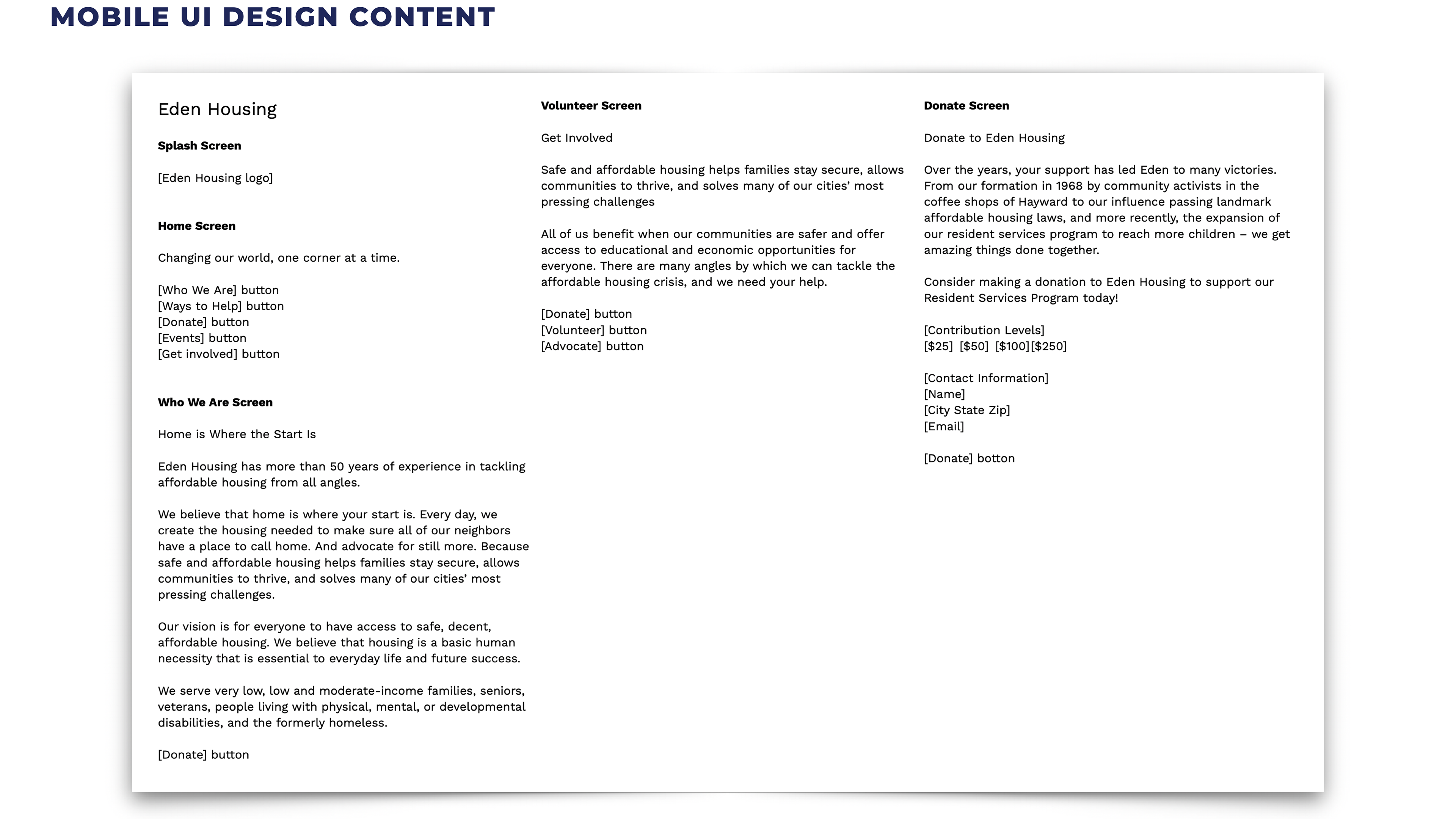
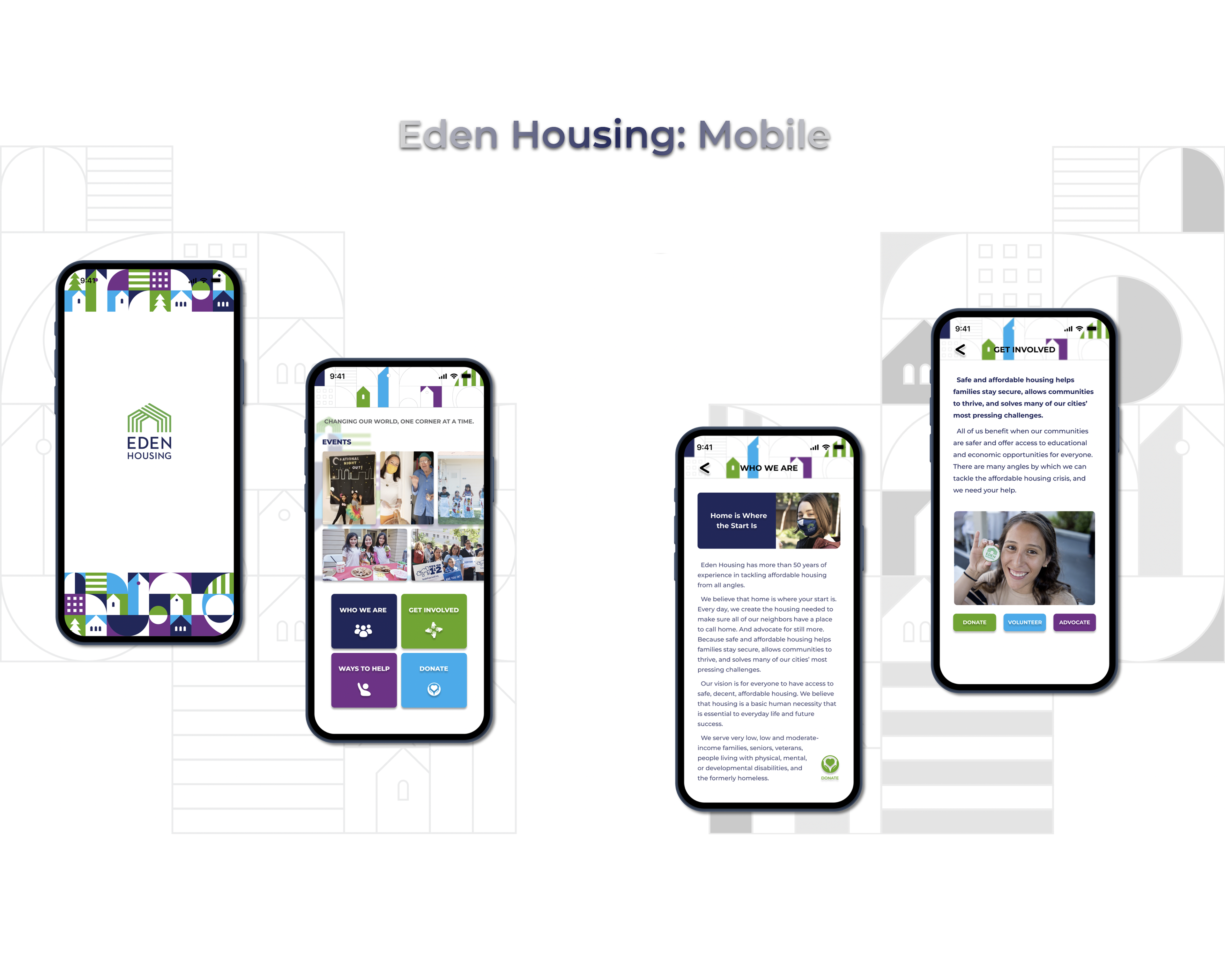
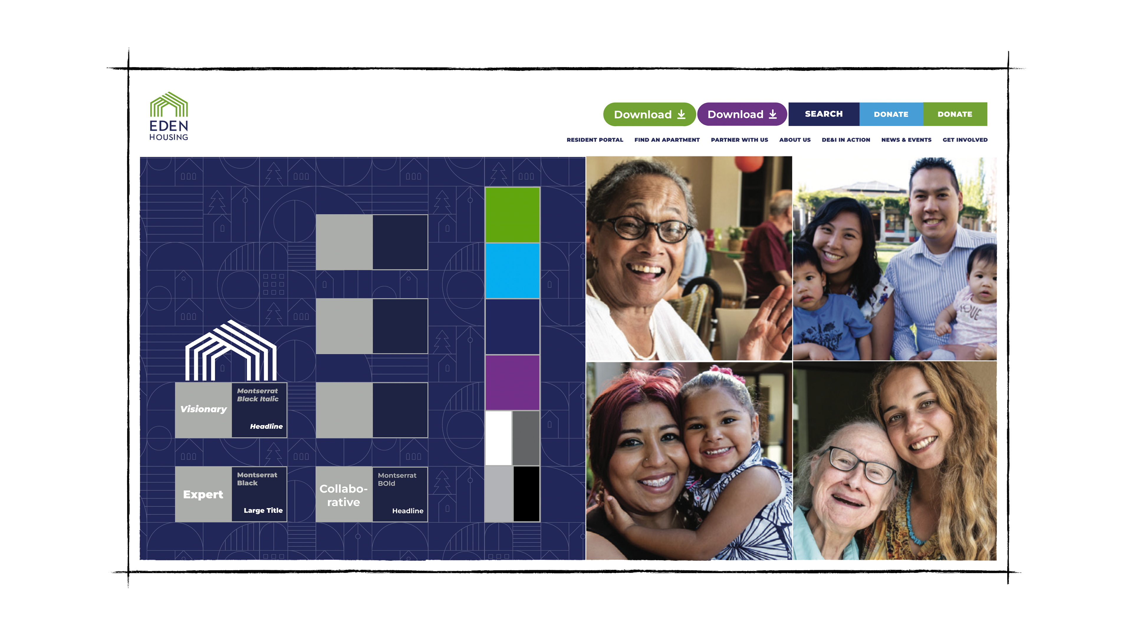
There's a lot of content, shown above, that needs to be included in the app design, so organizing it in an elegant and coherent way was my top priority.
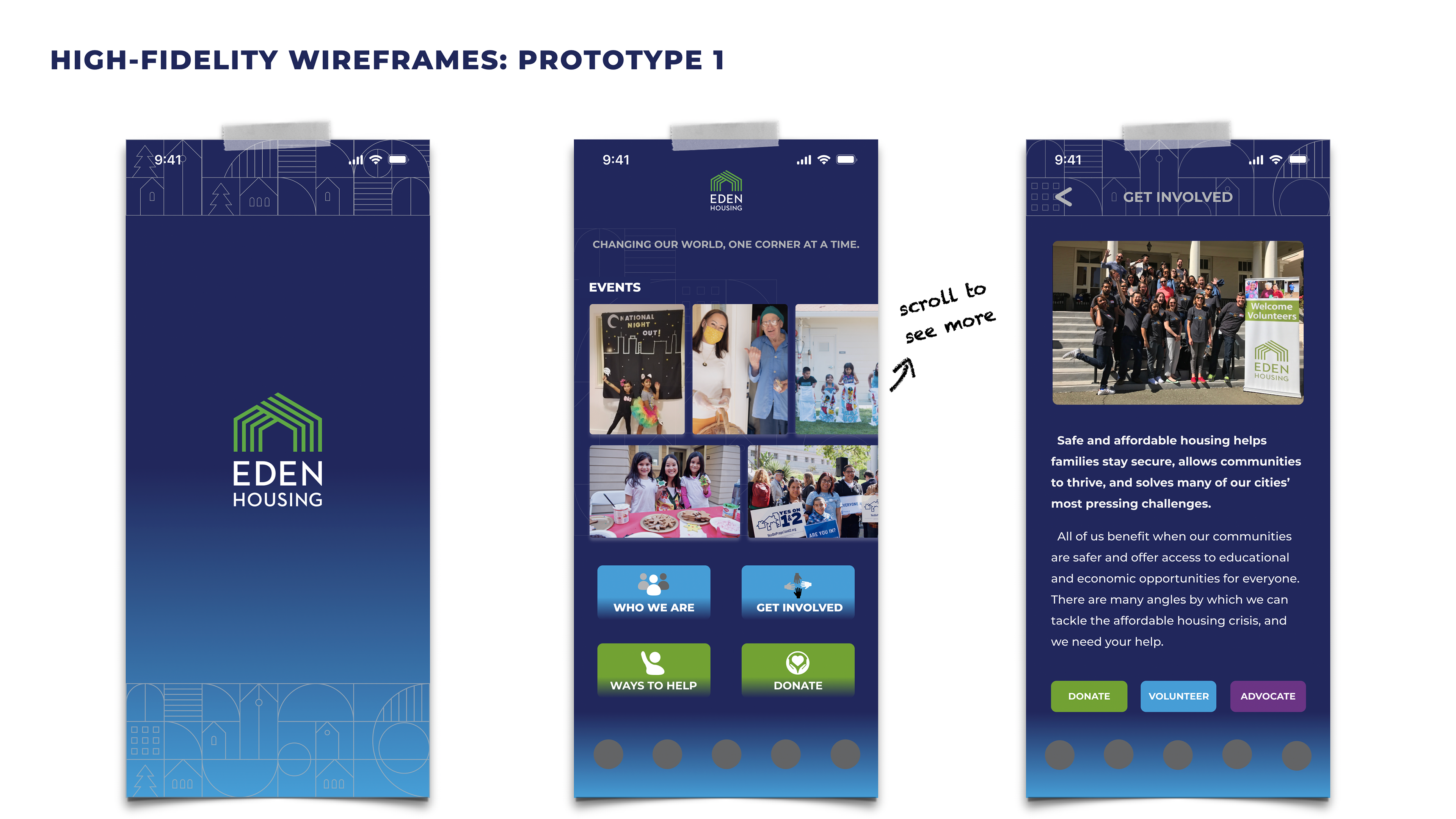
In prototype 1, I used the dark blue color from Eden Housing's brand book as the app's background color.
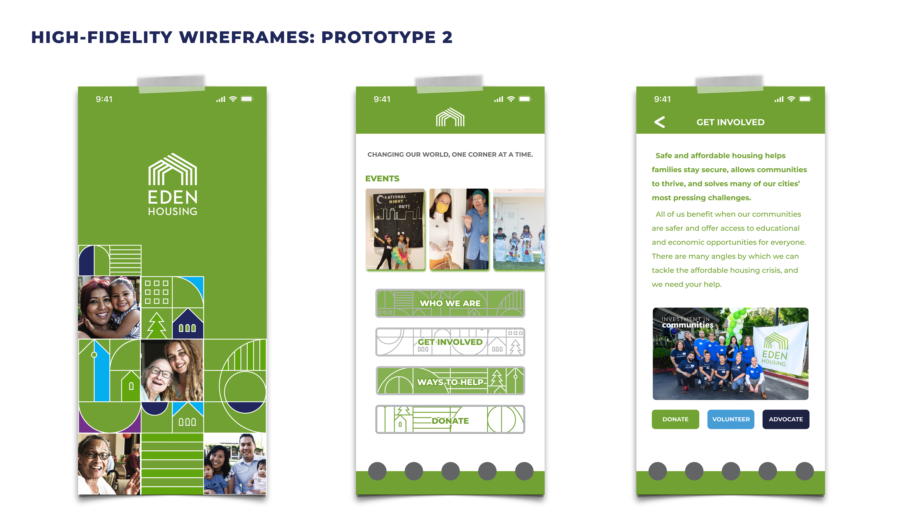
Same with the green color used here -- they were taken from Eden Housing's brand book. I added photos to the splash screen to give it a touch of friendliness.
These visual elements below were also taken from the brand book -- playful, but somewhat distracting for app users.
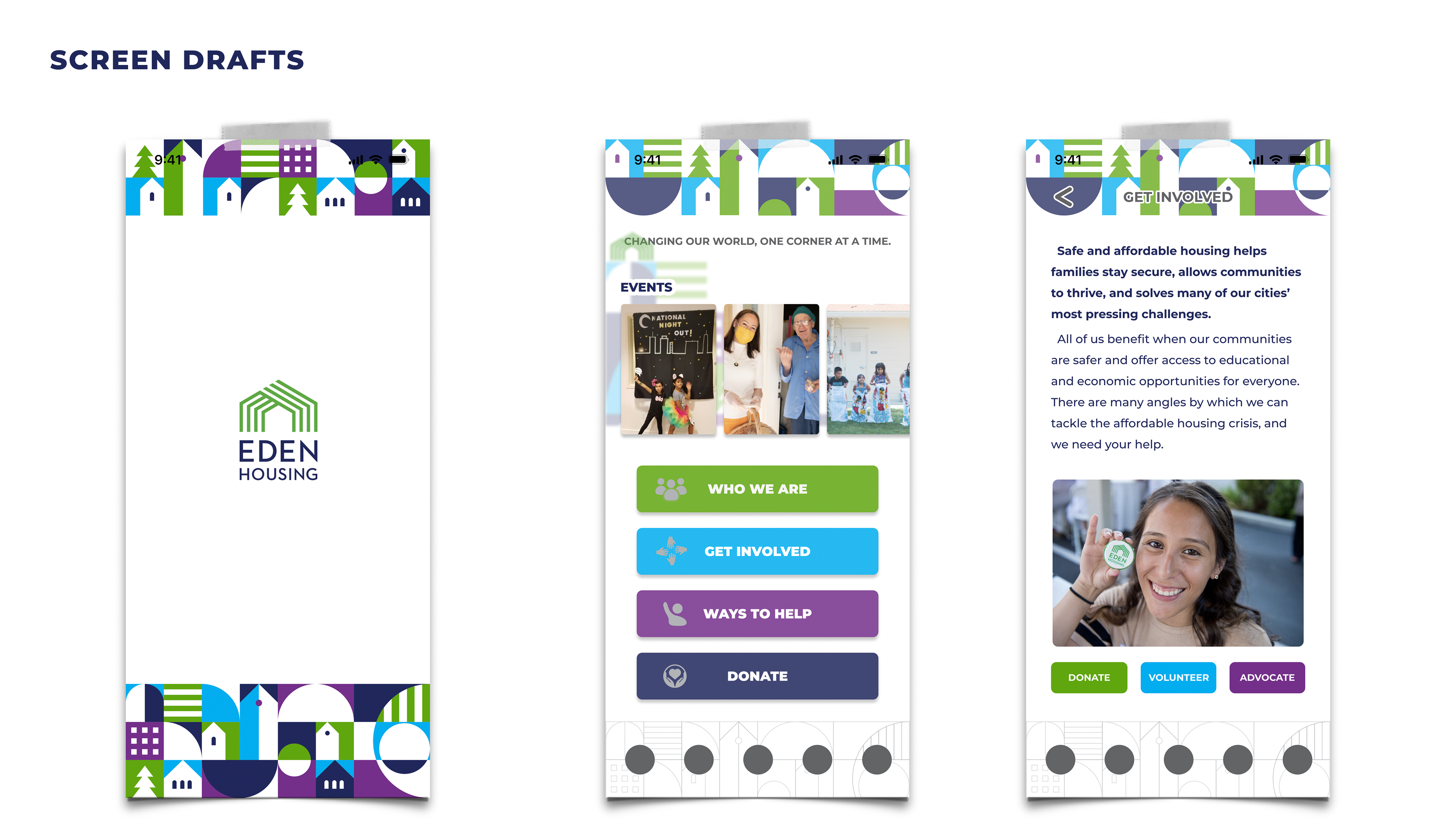
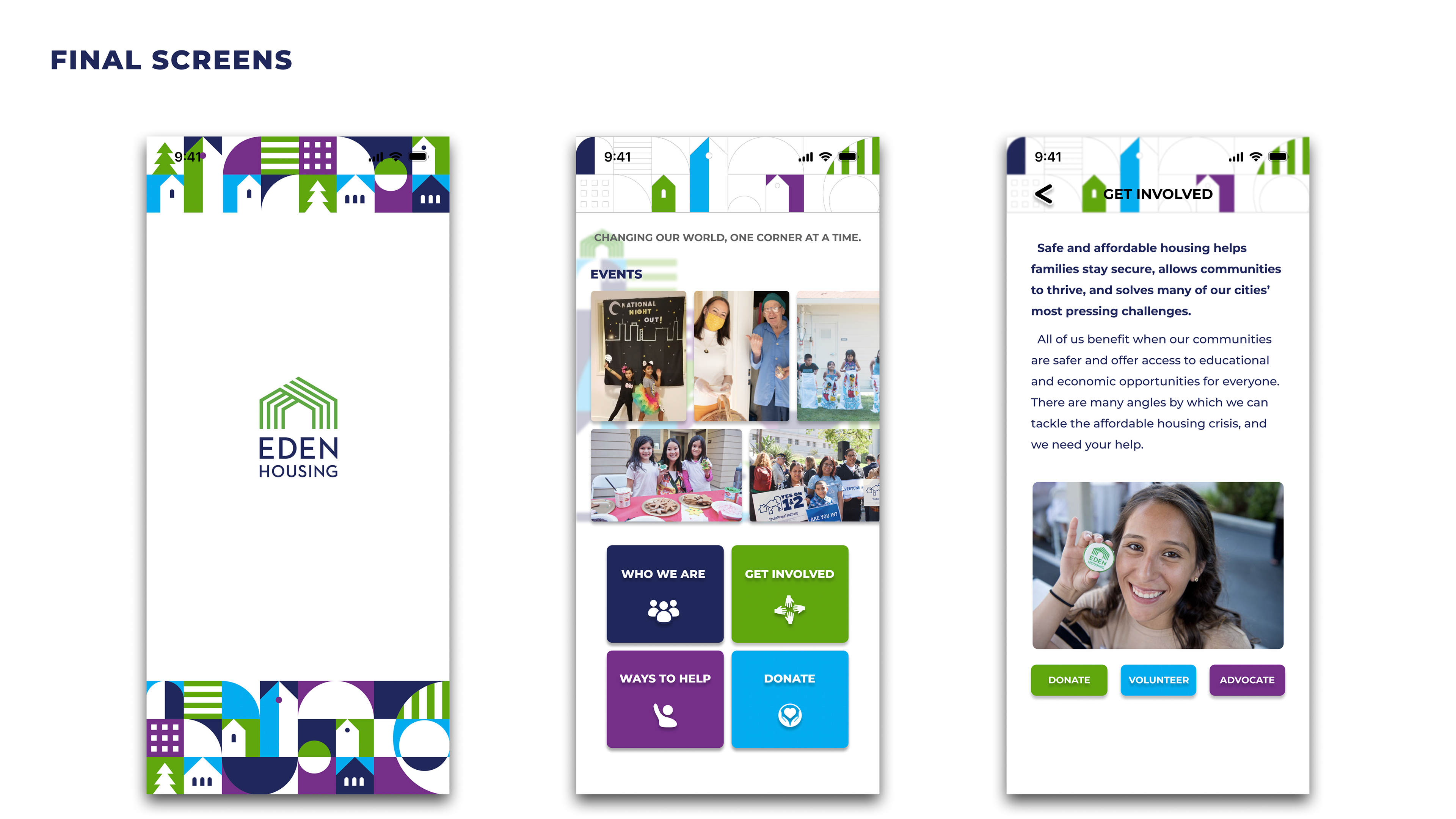
Eventually, I landed on the third prototype. I knew it might be more distracting as an app design, but I was fond of its playfulness and wanted to make it look less boring. Even though I changed some visual elements to reduce colors, there's still a minor legibility issue on the app's top bar.
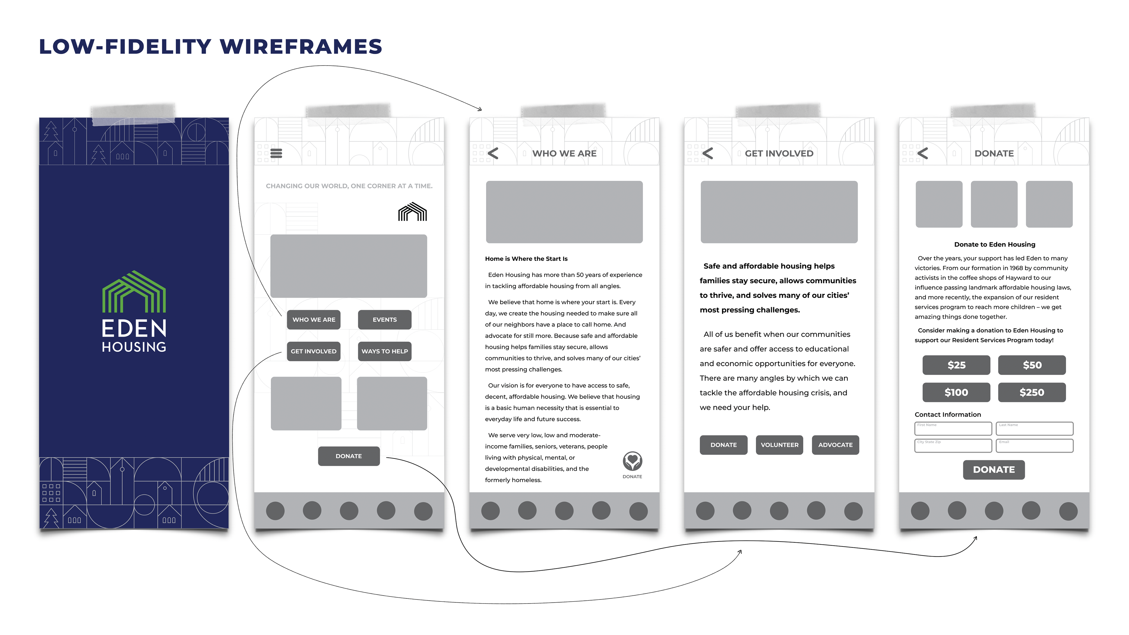
There's no need to design a bottom navigation bar for this app, so I removed it.
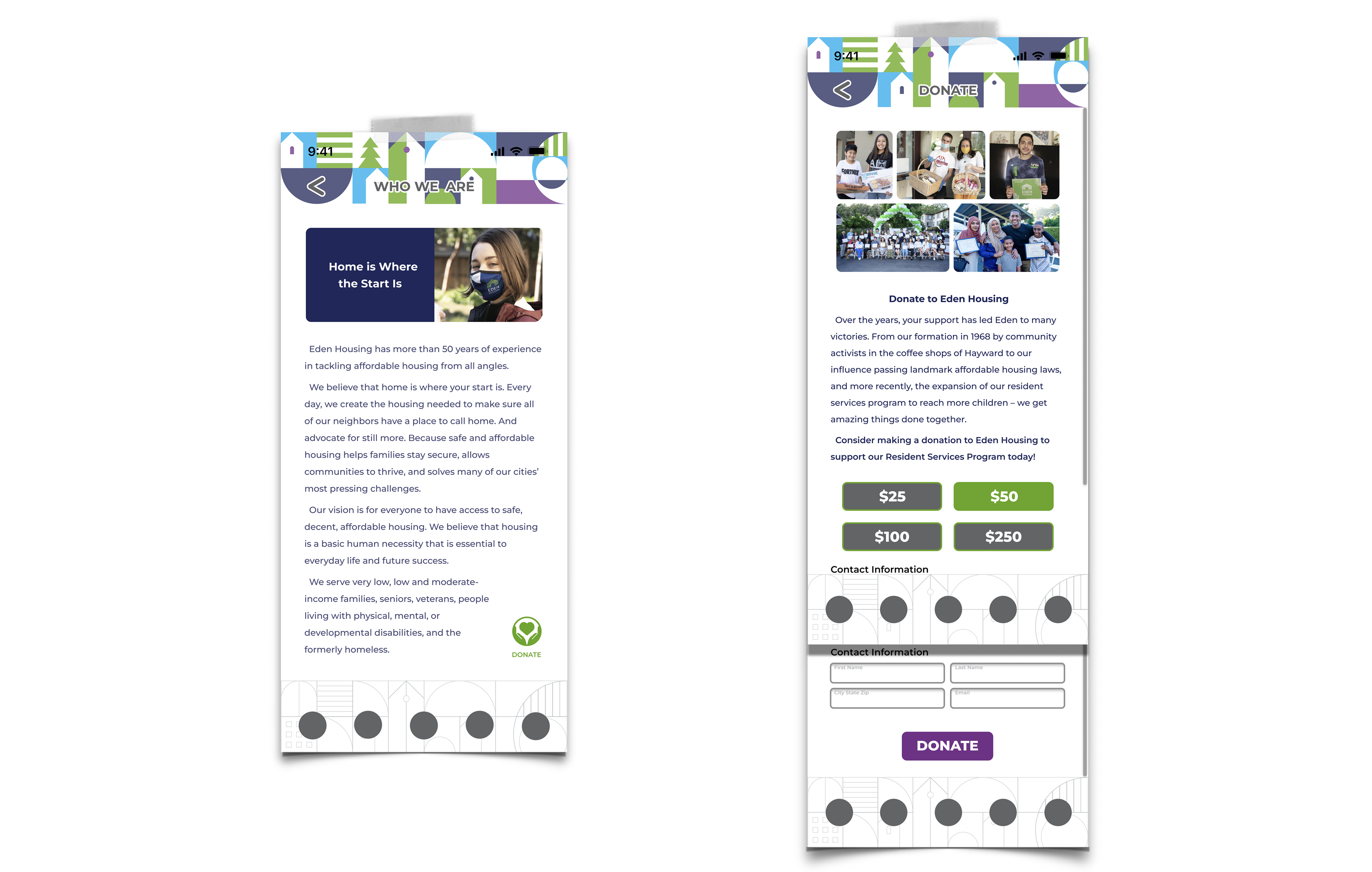
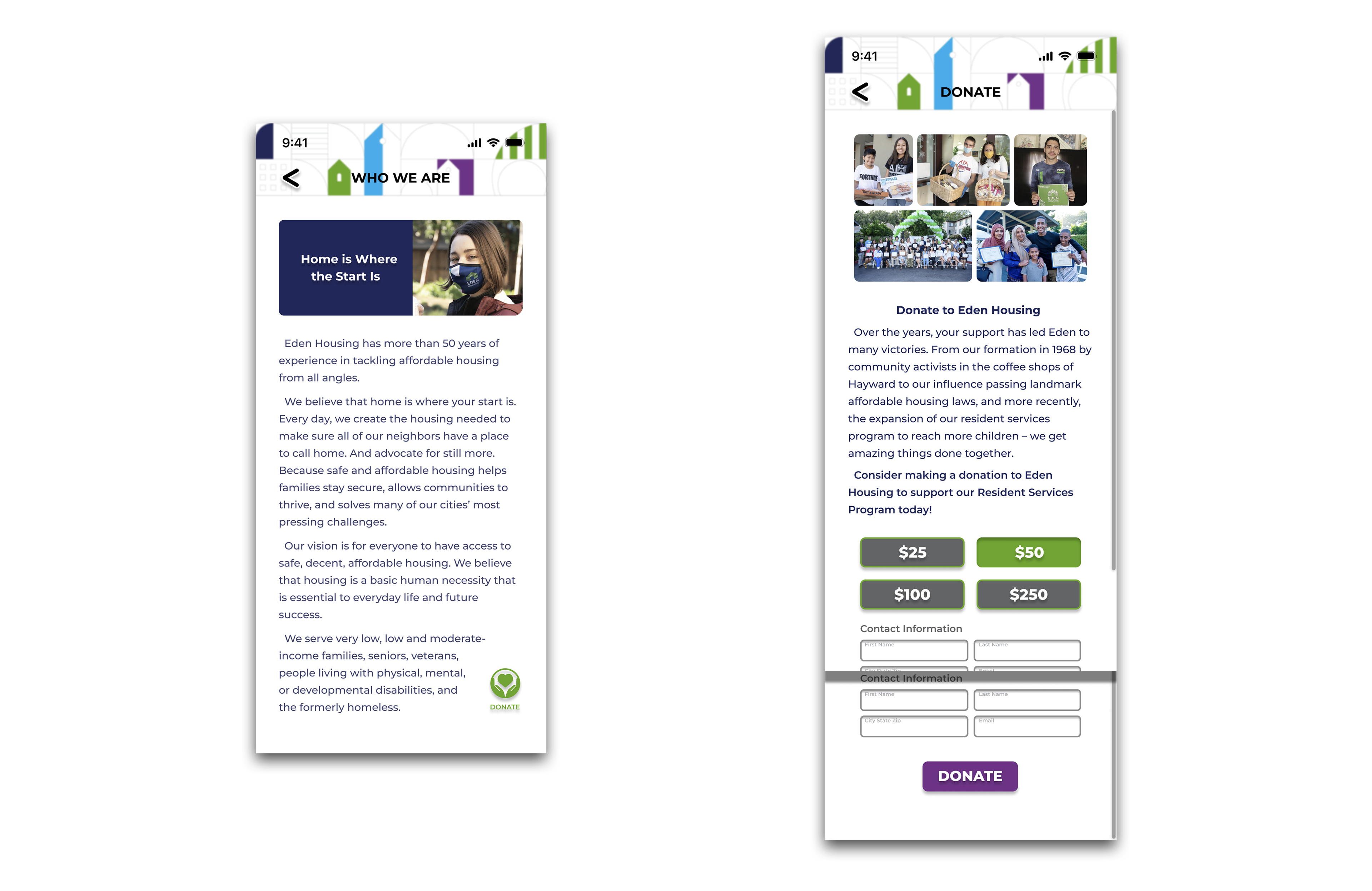
If I could do it again (unfortunately, I lost access to this Figma file), I would make some colors less saturated or more transparent; also, I'd reorganize Contact Information boxes from 2 columns x 2 rows to 1 column x 4 rows so they wouldn't be as overwhelming for users.